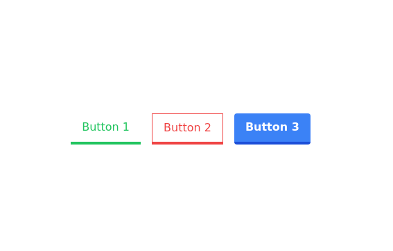
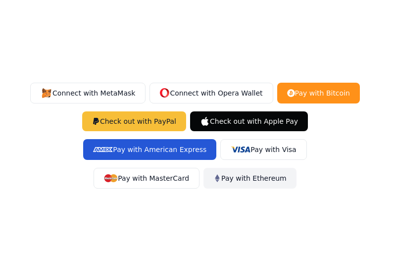
Buttons in pair
This tailwind example is contributed by Bunny, on 24-Jan-2023. Component is made with Tailwind CSS v3. It is responsive. It supports dark mode.

Author Bunny
Related Examples
-
 2 years ago12.5k
 -
 3 years ago18.2k
 -
 2 years ago7k
 -

-
 Ripple Button
Ripple Button is an interactive button component with a ripple animation that responds to user clicks
2 years ago13.4k -
 Animated Gradient Button Component
Button component with smooth hover effects and glass-morphism design. Features expanding gradient animation, rotating icon, and responsive layout. Perfect for call-to-action buttons, landing pages, and web applications. Easy copy-paste Tailwind CSS code ready for integration.
4 months ago717 -
Background gradient changing button
Automatic and continuously gradient-changing button. Cyclic color changing button.
2 years ago11.2k -
 Underline Hover Effect
Hover effect using after and before pseudo elements.
2 years ago9.4k -
 hero page
by salvator
8 months ago1.8k -
Canlı Yayın Butonu
Pulse efekt içeren canlı yayın butonu.
1 year ago1.7k -
 1 year ago3.2k
 -
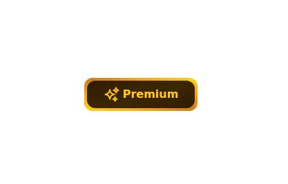 Gold Premium Button
🪙 Glowing Premium BIP Gold Button in pue Tailwind CSS
2 years ago5.6k


Explore components by Tags
Didn't find component you were looking for?
Search from 3000+ components