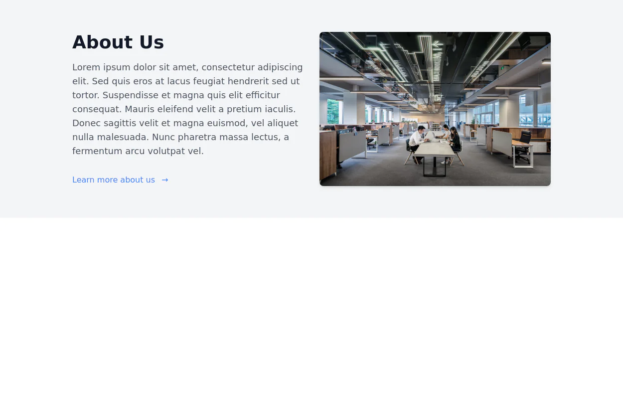
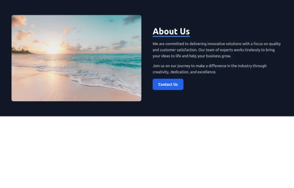
About Us
This tailwind example is contributed by ariaw, on 16-Oct-2025. Component is made with Tailwind CSS v3. It is responsive. similar terms for this example is about me

Author ariaw
Related Examples
-
 3 years ago15k
 -
 8 months ago987
 -
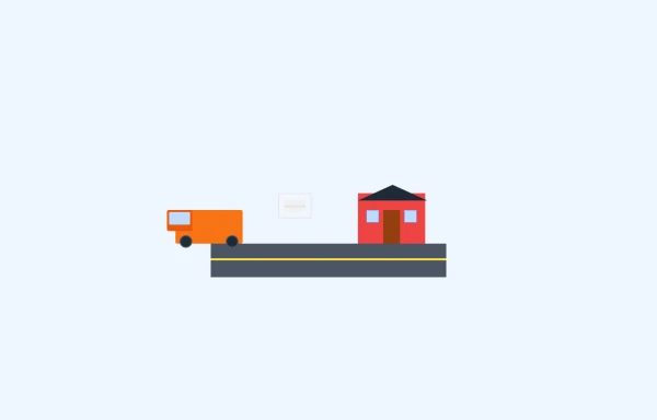 bugger delivary animation
this playground is responsive and animated bugger delivary
9 months ago669 -
 8 months ago1.4k
 -
 Donate Hero section
Best New tailwindcss,help save the children
9 months ago709 -
 Code Editor UI
Simple code editor prototype made with HTML and TailwindCSS. A lightweight template to explore and customize.
6 months ago473 -
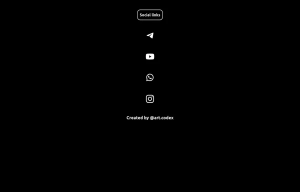 Social Media
Social Media button vertical dark style
5 months ago535 -
 canvas fully covers
canvas fully covers
1 year ago4.2k -
 1 year ago2.4k
 -
 portfolio
Complete Portfolio UI Kit with hero, about, skills, projects, testimonials, contact form, and footer. Fully responsive and dark mode supported using Tailwind CSS.
8 months ago895 -
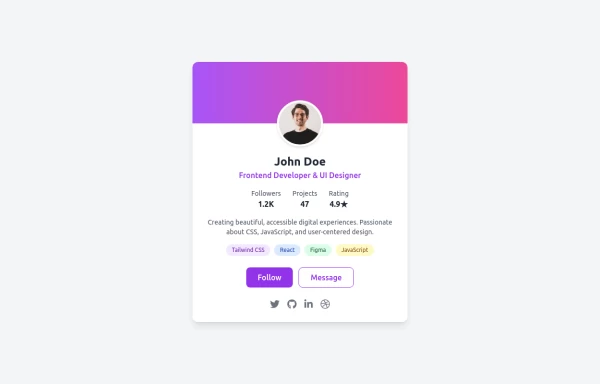 Uses emoji for attention, mentions key features (modern, responsive, accessible)
Drop-in Tailwind CSS profile card component with responsive layout, gradient header, and hover effects - zero custom CSS needed. Features skill tags, social icons, and clean stats display. Just copy-paste the HTML, swap in your details, and you're live. Perfect for portfolios, developer profiles, or link-in-bio pages.
11 months ago1.1k -
 10 months ago709


Explore components by Tags
Didn't find component you were looking for?
Search from 3000+ components