Stylish profile card with a hover effect
This tailwind example is contributed by Anonymous, on 07-Sep-2023. Component is made with Tailwind CSS v3. It is responsive. similar terms for this example are Author box, User information

Author Anonymous
Related Examples
-
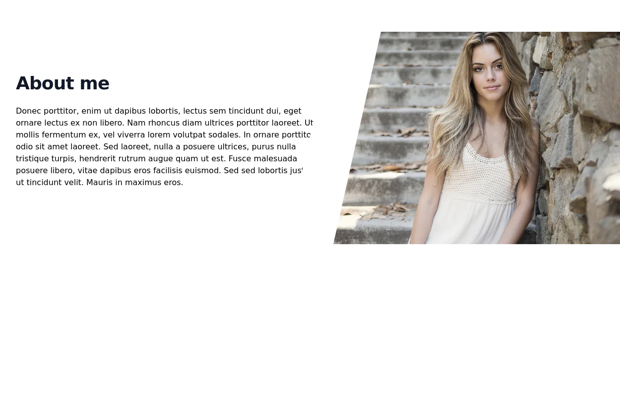
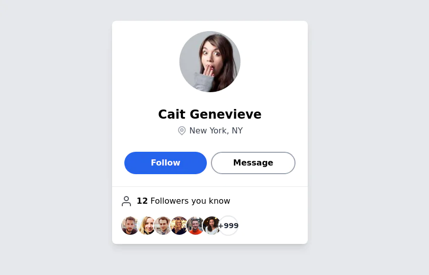 User Profile Card
The card features a user's profile picture, name, location, and options for interactions. It has a clean and modern design with rounded edges and icons for user engagement. It also has support for dark mod:
3 years ago64.5k -
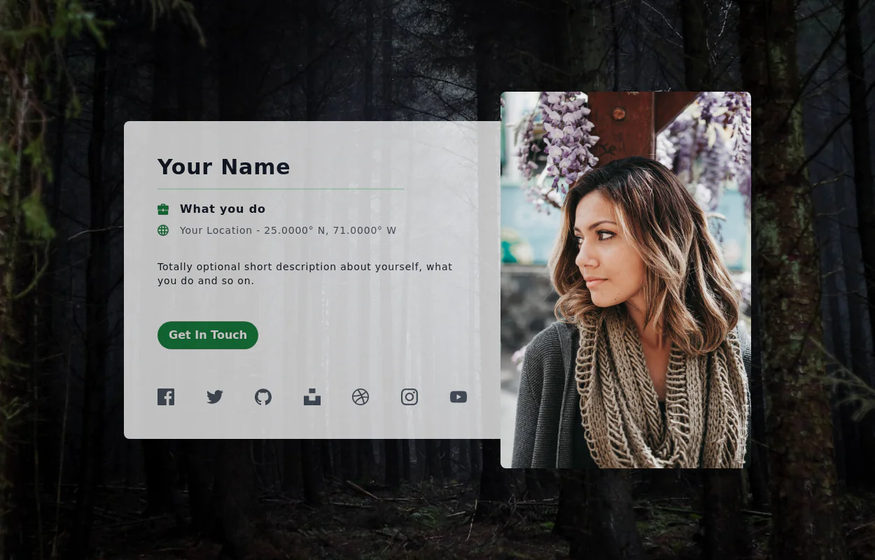 User Profile Card
Full-page Profile card
3 years ago19.5k -
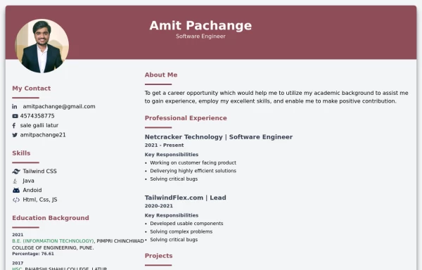
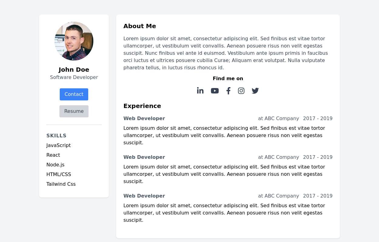 Basic Resume template
simple and clean layout that provides a professional look.
3 years ago27.7k -
 3 years ago32.8k
 -
 3 years ago24.9k
 -
 Modern resume template
modern resume template with data
2 years ago22.7k -
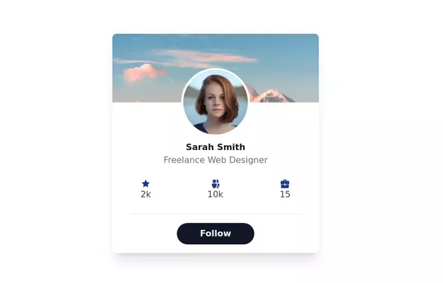
 User profile card with social icons
Showcases a user's profile information along with links to their various social media accounts.
3 years ago15.3k -
 3 years ago25.6k
 -
 portifolio
skills
10 months ago1.2k -
 Modern Responsive Footer with Tailwind CSS
This sleek and modern responsive footer is built using HTML and Tailwind CSS. It features three sections: brand information, useful links, and social media icons. The footer includes smooth hover effects, subtle fade-in animations, and a fully responsive design that adapts seamlessly to different screen sizes. Perfect for websites looking for a professional and stylish footer section.
1 year ago2.2k -
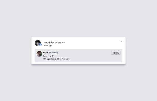 GitHub For you Feed
GitHub For you Feed Clone
1 year ago2.5k -
 TailwindFlex by omerlink
TailwindFlex
2 weeks ago186


Explore components by Tags
Didn't find component you were looking for?
Search from 3000+ components