Status Flow
This tailwind example is contributed by Anonymous, on 01-Sep-2026. Component is made with Tailwind v3.4.

Related Examples
-
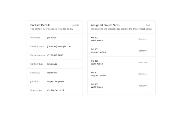 Updated customer details page
Customer details page
4.3k -

-
 Swiss-Grid Dark Pricing
A brutally minimalist pricing section that relies on strict grid architecture and typographic hierarchy instead of decorative elements. Features responsive border collapsing, monospaced technical accents, and high-performance CSS-only hover states. Designed for high-end SaaS, dev-tools, or agency portfolios that prioritize data clarity and structural rhythm.
827 -
 Modern Architecture Blog & News Grid UI Layout
A clean, minimal, and fully responsive Blog/News grid layout built with Tailwind CSS. Features a 2-column article grid with fixed title alignment, clean pagination, and a sticky sidebar with categories & CTA widget. Perfect for architectural firms, magazine portals, and CMS integrations.
107 -
 880
880 -
-
 Creative Bento Gallery
A modern bento-style gallery combining differently sized image cards in a structured and visually engaging layout.
307 -

-
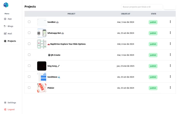 Table Content
Dashboard Table Content, with Sidebar Reusable for any window
2.9k -
 blog component
good blog
1.4k -
 Custom Audio Player
🎧 Custom Audio Player (HTML, Tailwind CSS & Alpine.js) A modern, responsive custom audio player built with Tailwind CSS and Alpine.js, designed for a smooth user experience and elegant visuals in both light and dark mode. ✨ Features: 🎵 Play, pause, and mute/unmute controls 📈 Interactive progress bar with seek functionality 🔊 Dynamic volume slider with live preview 🖼️ Album art and track details display ⌨️ Keyboard support — toggle play/pause with the spacebar 🌓 Fully responsive and dark-mode compatible This player uses minimal JavaScript, relying on Alpine.js for reactivity, and can be easily customized or integrated into any web project. Perfect for portfolios, podcasts, or music web apps.
1.5k -
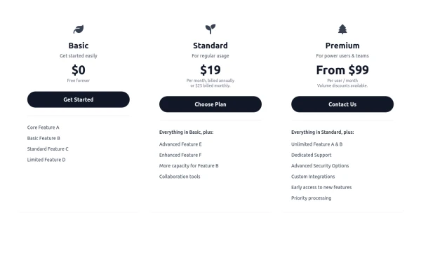 Responsive 3-Tier Pricing Card Section
A clean and responsive pricing table component featuring three distinct tiers (e.g., Basic, Standard, Premium) presented in a card layout. Built with HTML and Tailwind CSS, it stacks vertically on small screens and transitions to a side-by-side view on medium screens (md breakpoint - 768px) and up. Each plan card includes a placeholder icon, title, description, price details, a call-to-action button, and a bulleted list of features with checkmarks. The generic content makes it easy to adapt for various websites or applications needing a clear pricing comparison structure.
980









Browse by topic
Explore components by Tags
Jump straight to the UI pattern you need.
Can't find it?
Didn't find the component you were looking for?
Search across 3,000+ community-built components and grab the code in seconds.