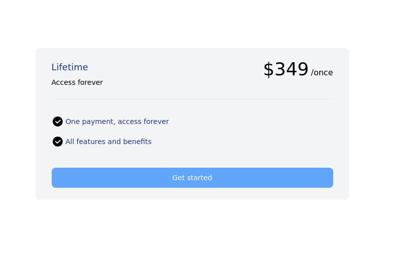
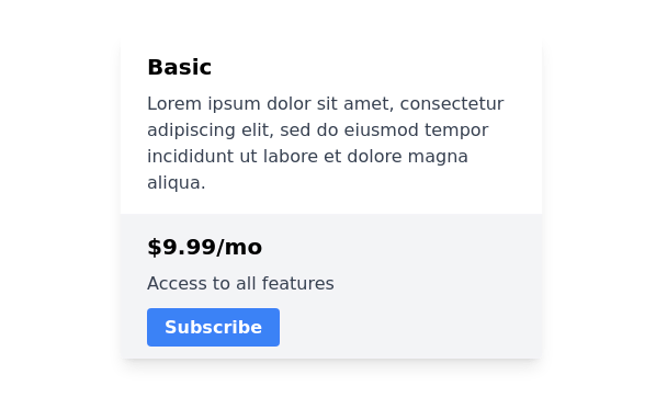
Pricing cards in pair
This tailwind example is contributed by Anonymous, on 07-Sep-2023. Component is made with Tailwind CSS v3. It is responsive. similar terms for this example are Service rates, Subscription plans

Author Anonymous
Related Examples
-
 3 years ago11k
 -
-
 2 years ago7.5k
 -
 pricing card
This frontend template is designed for a website that provides software services and open-source code to users. It serves as a clean, modern UI for browsing, searching, and downloading open-source projects. Building with HTML, tailwindcss for CSS ,
6 months ago652 -
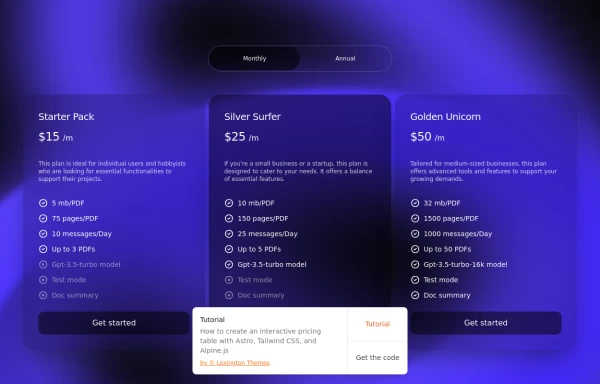
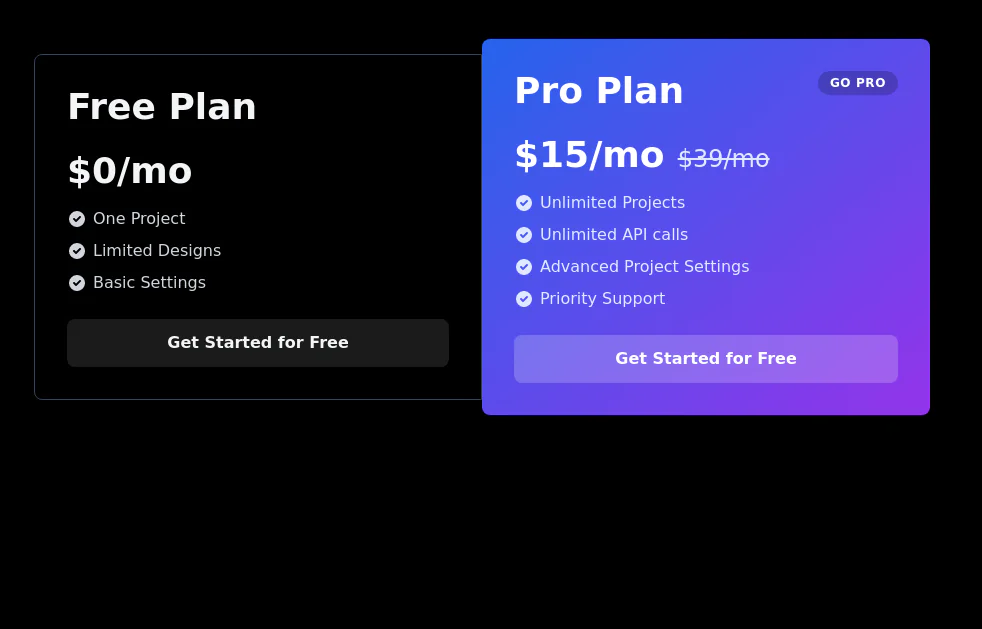
 Tiered Pricing Blocks
An organized way to compare different product offerings or pricing tiers. Users can quickly assess the features and pricing for various products.
2 years ago9.5k -
 3 years ago11.7k
 -
 3 years ago11k
 -
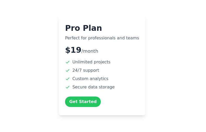
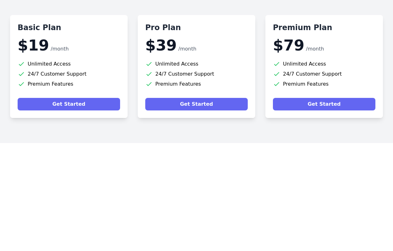
 Pricing Plans
This plan offers access to all basic features, including unlimited projects and 24/7 support
9 months ago767 -
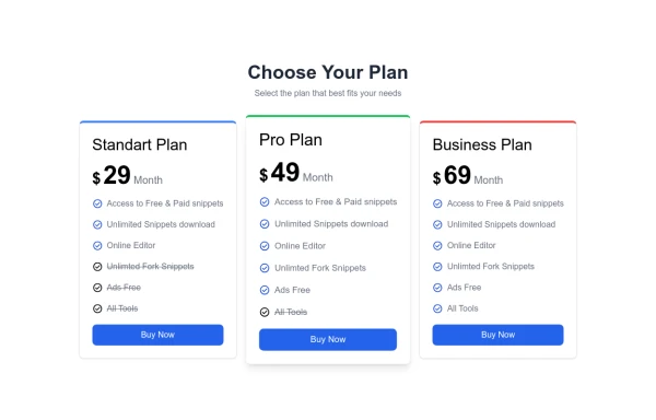
 Pricing Table
Modern and visually appealing design
2 years ago7k -
 Services
explore our awesome Services
1 year ago2.8k -
 Une structure simple et transparente. pricing
Une structure simple et transparente. pricing
2 weeks ago8 -
 Ticket Options ios 26
Ticket Options ios 26
3 months ago199


Explore components by Tags
Didn't find component you were looking for?
Search from 3000+ components