Best Responsive Navbar Design | Easy & Modern Navigation
Learn how to create a fully responsive navbar using HTML, CSS, and JavaScript. Perfect for beginners and developers looking for a modern, mobile-friendly navigation bar.
This tailwind example is contributed by Vishvajeet, on 06-Feb-2025. Component is made with Tailwind CSS v3. It is responsive.

Author Vishvajeet
Related Examples
-
 3 years ago14.4k
 -
 Hero simple
hero design simple
10 months ago1.4k -
 3 years ago62k
 -
 3 years ago16.8k
 -
 1 year ago2.6k
 -
 Repsonsive Navbar
fully respondive navbar
1 day ago14 -
 8 months ago735
 -
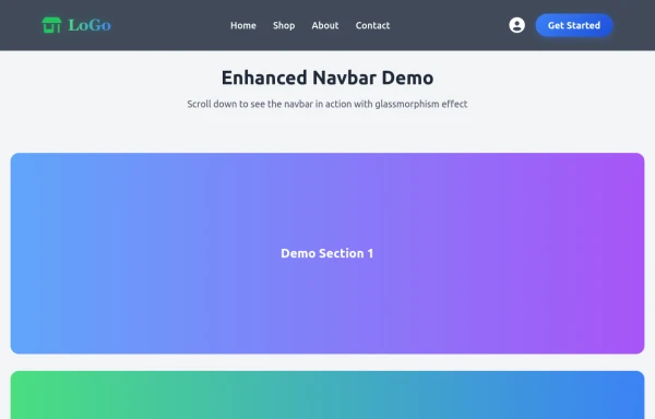 Enhanced Modern Navbar
The navbar now feels premium and modern while maintaining all original functionality. The glassmorphism effect, smooth animations, and professional styling create a cutting-edge user experience that would fit perfectly on any modern website!
9 months ago869 -
 Life Tree
by salvator
9 months ago988 -
 flower
by salvator
9 months ago1.4k -
 Game changer
by salvator
9 months ago1.1k -
 1 year ago5.5k


Explore components by Tags
Didn't find component you were looking for?
Search from 3000+ components