Tour package card
This card could be used for featuring a product, service, or blog post:
This tailwind example is contributed by Henrik R., on 02-Aug-2024. Component is made with Tailwind CSS v3. It is responsive.

Author Henrik R.
Related Examples
-
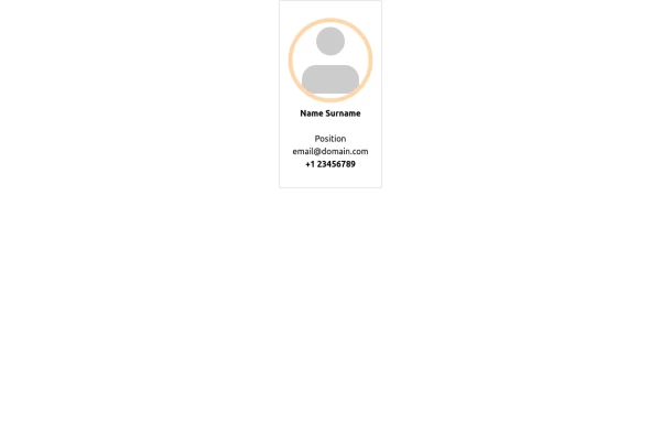 Personal card
A card to show minimal info for staff member
1 year ago1.3k -
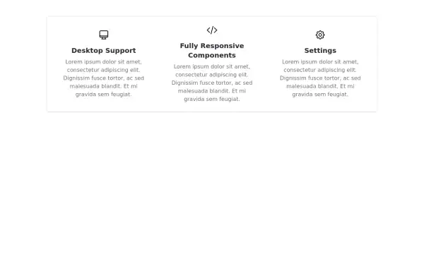 Responsive Features Section
It's a Handy Ready to Use Responsive Features or Services Component with Dark Mode
2 years ago5.3k -
 6 months ago428
 -
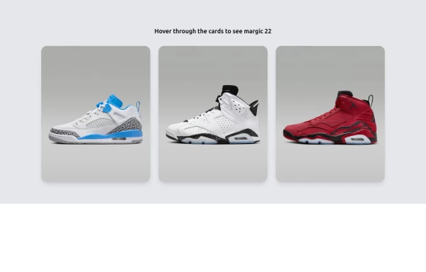 Amazing E-commerce card 2
An amazing e-commerce card with stunning hover effect 2
1 year ago1.7k -
 pile carde scroll
pile carde scroll
1 month ago131 -
-
 Kids E-learning Platform Card
Kids E-learning Platform Card Clone
1 year ago1.8k -
 HighLight
Highlight section. Find it makecomponents.com
1 year ago2.2k -
 1 year ago2.1k
 -
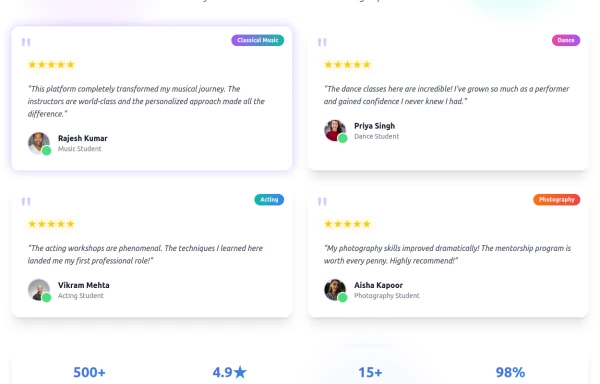 Enhanced Student Testimonials Section
A modern, interactive testimonials section featuring glassmorphism design, floating animations, and social proof elements. Includes star ratings, course badges, user profiles with online status indicators, and a stats section. Built with Tailwind CSS and features gradient backgrounds, hover effects, and responsive design optimized for showcasing student success stories and building credibility.
7 months ago768 -
 1 year ago1.3k
 -
 3 years ago13.8k


Explore components by Tags
Didn't find component you were looking for?
Search from 3000+ components