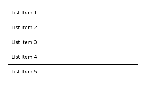
Responsive list with 3 columns
This tailwind example is contributed by TailwindFlex, on 05-Jan-2023. Component is made with Tailwind CSS v3. It is responsive.

Author TailwindFlex
Related Examples
-
 3 years ago19k
 -
 2 years ago19.2k
 -
 3 years ago13.7k
 -
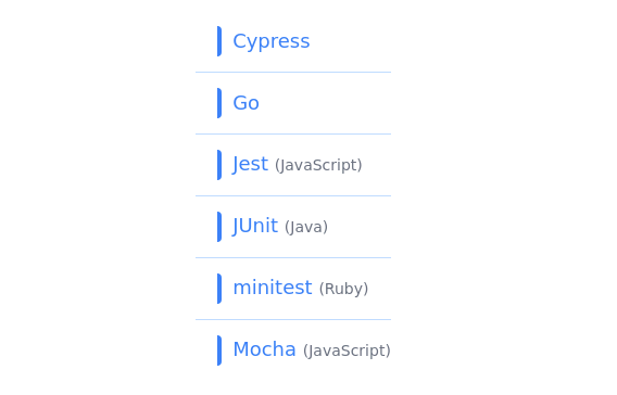 List section
Beautiful list section with left border
3 years ago11.3k -
 3 years ago10.5k
 -
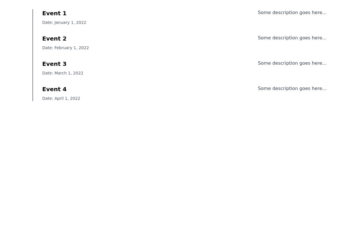
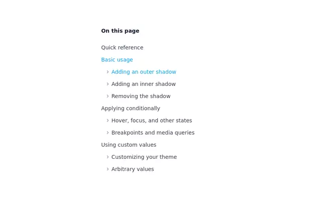 Nested list
A nested list is suitable for a table of contents / navigational list
3 years ago21.3k -
 3 years ago10.3k
 -
 3 years ago11.3k
 -
-
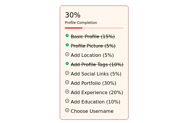
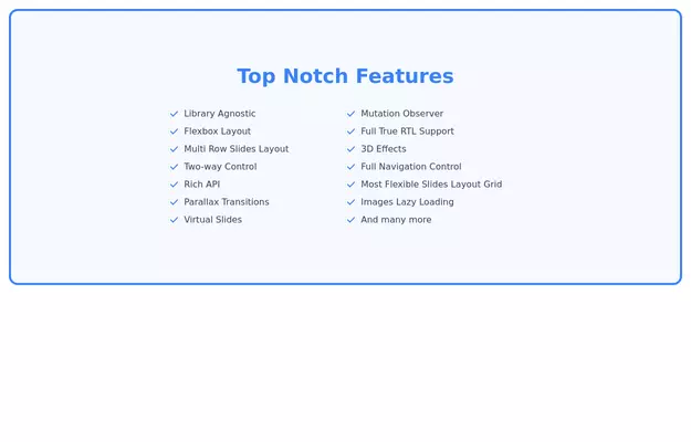 Feature List
Feature List Card (Responsive and supports Dark Mode)
3 years ago11k -
 3 years ago13.6k
 -
 3 years ago10.3k


Explore components by Tags
Didn't find component you were looking for?
Search from 3000+ components