153+ Free Call to Action examples in Tailwind CSS
A call to action (CTA) is a piece of content, typically in the form of a button or link, that encourages the user to take a specific action. This action could be anything from signing up for a newsletter to making a purchase on a website.
A call to action is often used in marketing and advertising to drive users toward the desired outcome, such as making a purchase or filling out a form. A well-designed call to action can be an effective way to guide users toward taking the desired action and can help increase conversions and engagement on a website or application.
Similar terms: CTA,banner
-
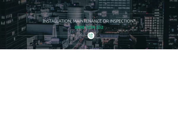 Call ya
Simple Call-to-Action
1 year ago1.3k -
-
 1 year ago1.6k
 -
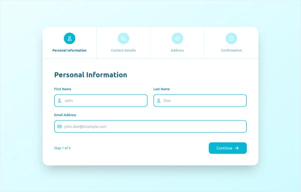 stepper
The Stepper Component is a versatile and user-friendly tool designed to guide users through a sequence of steps. Whether you're building a multi-step form, a tutorial, or any process that requires sequential navigation, this component makes it easy to implement and customize.
1 year ago1.6k -
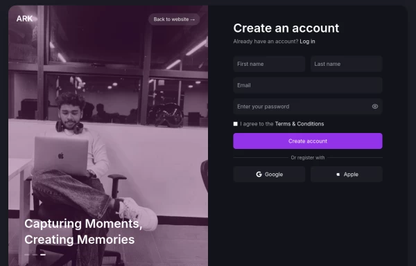 Login page
Login and register page, you can reuse both
1 year ago1.8k -
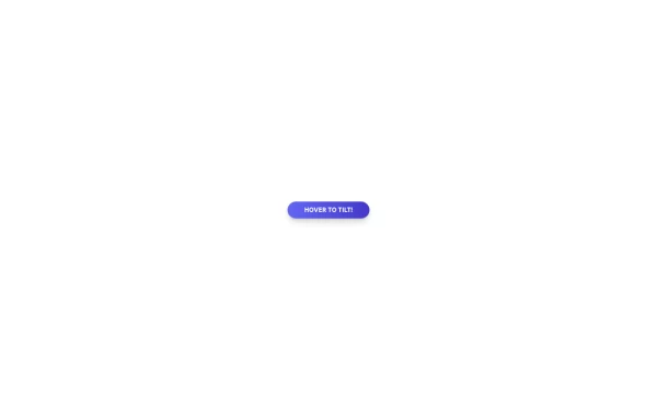
 Tilted button on hover.
A simple button with a gradient and tilt on hover. Dark mode supported with same color.
1 year ago1.1k -
 11 months ago1.6k
 -
 10 months ago834
 -
 10 months ago2.2k
 -
 10 months ago1.4k
 -
 10 months ago1.8k
 -
 Tilted button on hover.
A simple button with a gradient and tilt on hover. Dark mode supported with same color.
10 months ago858 -
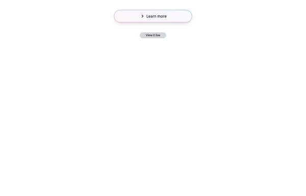 Bubblegum Button
This interactive button component is designed with a sleek gradient background and smooth hover effects, making it an eye-catching call-to-action element for modern web interfaces. Styling and Features: ✅ Gradient Background & Rounded Shape • The button container has a subtle gradient overlay (bg-gradient-to-tr) that smoothly transitions from soft pink (from-pink-300) to light blue (to-blue-300), giving it a vibrant and modern look. • Wrapped in a rounded-full container for a pill-shaped aesthetic. ✅ Floating & Shadow Effects • The shadow-lg property creates a soft floating effect, enhancing depth and visibility. • Will-change-transform optimizes animations for a seamless hover experience. ✅ Interactive Hover Animations • On hover, the inner button scales up (hover:scale-105) and lifts slightly (hover:-translate-y-2), simulating a press-and-release motion. • The transition is smooth, with a 500ms animation (transition duration-500). ✅ Content & Icon • The “Learn more” label is paired with a right-arrow icon (svg) for clear visual guidance. • The icon and text are flex-aligned (items-center flex), ensuring a balanced and responsive layout. This button is ideal for call-to-action elements, product highlights, or download prompts, offering a modern, sleek, and engaging user experience. 🚀
1 year ago1.4k -
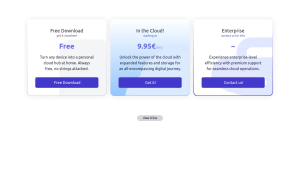 Interactive Pricing Table
This modern pricing component features a visually appealing, responsive layout with smooth hover effects, making it ideal for showcasing different plans and subscription tiers. Design and Features: ✅ Elegant Gradient Backgrounds • Each pricing card has a unique gradient overlay, transitioning from soft gray, blue, or indigo to white, enhancing contrast and visual appeal. • The rounded-2xl design ensures a polished and smooth aesthetic. ✅ Interactive Hover Effects • Cards have a subtle hover shadow enhancement, making them pop on interaction (hover:shadow-[0_0px_25px_0px_rgba(0,0,0,0.2)]). • Slight floating effect (hover:translate-y-[-5px]) gives the illusion of elevation on hover. ✅ Pricing & Plan Details • Each card presents a plan title, a short subtitle, and a bold price display (text-3xl font-extrabold text-indigo-500). • Supports free, subscription-based, and enterprise-tier pricing, ensuring flexibility for different business models. ✅ Call-to-Action Buttons • Each plan features a highly visible CTA button (bg-indigo-700 text-white rounded-md). • The buttons change color on hover (hover:bg-indigo-500) and expand slightly, encouraging user interaction. ✅ Animated Background Icons • A large, transparent icon (text-[500px] text-gray-100) dynamically moves on hover (group-hover:-translate-y-8 group-hover:-translate-x-8), adding depth and a premium feel. This pricing component is perfect for SaaS platforms, digital subscriptions, and service offerings, ensuring a modern, sleek, and engaging user experience. 🚀
1 year ago1.7k -
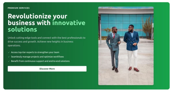
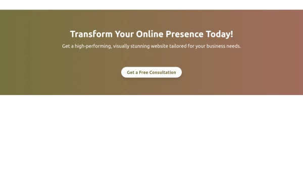 Boost Your Business with a Stunning Website!
Take your online presence to the next level with a high-performing, visually captivating website. Let’s build something amazing together!
10 months ago822


Didn't find component you were looking for?
Search from 3000+ components