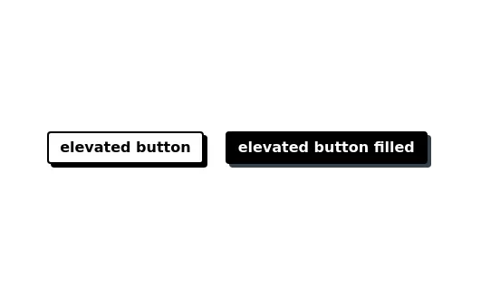
Button with shadow
This tailwind example is contributed by Laurits, on 22-Nov-2022. Component is made with Tailwind CSS v3. It is responsive. It supports dark mode.

Author Laurits
Related Examples
-
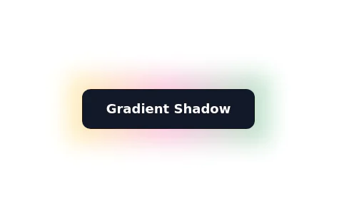
Glowing gradient button
Button on black background
2 years ago35.8k -
 2 years ago13.7k
 -
 2 years ago16.1k
 -
 Floating buttons examples
Bottom-Right Corner, Bottom-Left Corner, Top-Left Corner, Top-Right Corner, Center, Bottom-Center
2 years ago23.6k -
2 years ago15.3k
-
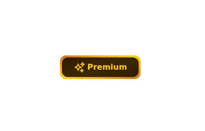 Gold Premium Button
🪙 Glowing Premium BIP Gold Button in pue Tailwind CSS
1 year ago5.1k -
 10 months ago1.6k
 -
 Tab Menu
Tab menu
1 year ago5.4k -
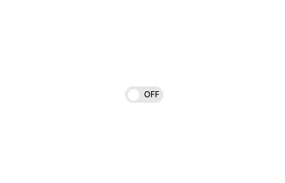 Interactive Toggle Switch with Smooth Animation
A stylish toggle switch component built with Tailwind CSS and enhanced with minimal JavaScript. This toggle switch features smooth color transitions, dynamic text ("ON/OFF"), and a moving indicator ball, providing a visually appealing and functional design. Ideal for modern web interfaces where toggling functionality is required. Easily customizable for various use cases.
4 months ago848 -
2 years ago13.2k
-
Plug and Play Animated Button for Hero Statements / Landing Pages
REMOVE the bg-black from the outside <button/> div, if you are already using a black background. Besides this, the button is plug and play! Know errors: You may need to remove animate-spin for your usecase, depending on framework rendering. For SvelteKit, animate-spin is NOT needed. But the [animation:spin_4s]... is always necessary for a smooth effect. Check out my profile to join my community online or add me on LinkedIn.
7 months ago1.3k -
 Tilted button on hover.
A simple button with a gradient and tilt on hover. Dark mode supported with same color.
4 months ago547


Explore components by Tags
Didn't find component you were looking for?
Search from 2400+ components