Navbar
navbar
This tailwind example is contributed by Haqiman, on 29-Sep-2026. Component is made with Tailwind v3.4. It is responsive.

Related Examples
-

-
 Navbar
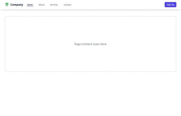
This navbar implementation includes: 1. Responsive design that works on both desktop and mobile 2. Indigo-800 and Blue-900 color scheme for the background and accents 3. Dark mode support with a toggle button 4. Beautiful animations and effects: 1. Fade-in animation for menu items with staggered delays 2. Hover effects on menu items with underline animation 3. Smooth color transitions 4. Mobile menu slide-down animation 5. SVG icons for the dark mode toggle and mobile menu button 6. "Sign Up" call-to-action button 7. Mobile-friendly dropdown menu 8. Accessibility considerations (proper heading structure, color contrast, focus styles) Key features: - The background uses a gradient from Indigo-800 to Blue-900 - The navbar has a white background in light mode and dark gray in dark mode - Text colors are adjusted for readability in both light and dark modes - Menu items have hover effects with color changes and underline animations - The dark mode toggle changes its icon based on the current mode - The mobile menu slides down with a smooth animation when toggled - Desktop menu items fade in with a staggered delay for a smooth entrance - Dark mode is automatically applied based on system preferences - The layout is responsive, with a hamburger menu for mobile screens This implementation provides a visually appealing and functional navbar with various animations and effects, using HTML, Tailwind CSS, and vanilla JavaScript for the interactions.
5.2k -
 sidebar responsive
responsive sidebar with working links
1.3k -
 Modern Retail Analytics Dashboard UI with Interactive Charts
Dashboard built with HTML, Tailwind CSS, and vanilla JavaScript.
342 -
 navbar moderne et epure
786 -
-
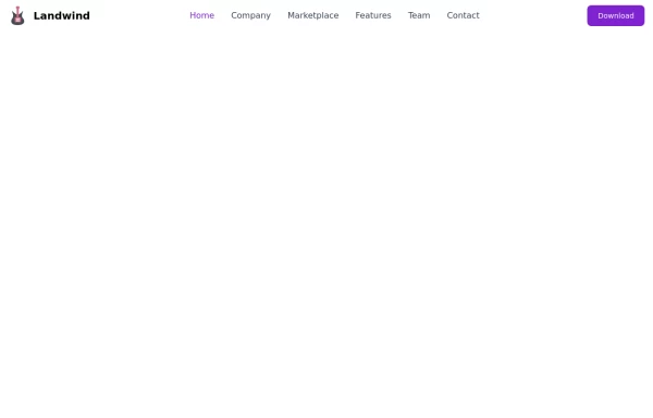 Responsive navbar
navbar with the dropdown on mobile devices
40k -
 Sticky Navbar
A modern, feature-rich, and fully responsive navigation bar built with Tailwind CSS. This premium navbar includes a top contact bar, multi-level mega menus, live search with suggestions, mobile drawer navigation, nested accordion menus, authentication buttons, sticky header, and smooth interactions. Perfect for SaaS, corporate, startup, agency, eCommerce, legal, education, and business websites.
280 -
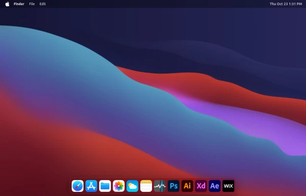 macOS Style Webpage – macOS Design in the Browser
A simple webpage inspired by the macOS interface. It recreates the clean design, dock, and desktop look of macOS using only HTML, tailwind CSS, and JavaScript. This project focuses on front-end styling and layout to bring the visual feel of macOS to the web — not a full simulation, just the look and vibe.
2.5k -
 Modern SaaS Agency Landing Page with Dark Mode & Mobile MenuE-Com With nav and filter
A premium SaaS agency landing page built with HTML, Tailwind CSS, and JavaScript. It features a sticky glassmorphism navbar, responsive mobile navigation drawer, light/dark mode toggle, animated hero section, case studies, services, process timeline, testimonial, FAQ accordion, booking CTA, and a clean modern footer. Perfect for startups, AI products, software agencies, creative studios, and digital businesses.
407 -
 Elegant NavBar
Useful Tailwind classes for constructing a basic NavBar.
2.1k -
 Fashion Landing Page with Hero Slider, GSAP Animations
fashion/eCommerce landing page built using HTML, CSS, GSAP, Swiper.js, and Lenis Smooth Scroll.
403




Browse by topic
Explore components by Tags
Jump straight to the UI pattern you need.
Can't find it?
Didn't find the component you were looking for?
Search across 3,000+ community-built components and grab the code in seconds.