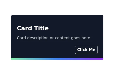
Responsive card with image
This tailwind example is contributed by Simon Scheffer, on 23-Dec-2022. Component is made with Tailwind CSS v3. It is responsive.

Author Simon Scheffer
Related Examples
-
 3 years ago24.4k
 -
 Card with image full width
This component is a card designed for showcasing featured blog posts. It includes the post title, a captivating image, category links, and author details.
3 years ago13.9k -
 3 years ago15.1k
 -
 Customer testimonial card
Responsive user testimonial card with image
3 years ago12.1k -
 3 years ago25.4k
 -
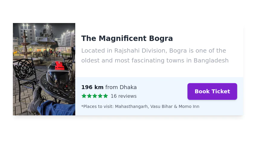 Service/Product card
Tour trip booking showcase card
3 years ago13.1k -
 Responsive Card Grid
Tailwind CSS responsive grid for feature listing. The cards have a teal background, rounded corners, and a concise display of feature titles, descriptions, and a "Learn More" link.
3 years ago52.3k -
 User Profile Card
The card features a user's profile picture, name, location, and options for interactions. It has a clean and modern design with rounded edges and icons for user engagement. It also has support for dark mod:
3 years ago64.3k -
 Call to action card with image
Responsive card with image
2 years ago16.5k -
 3 years ago16.1k
 -
 Card post blog
Targetas para blog
3 months ago365 -
 1 year ago2.9k


Explore components by Tags
Didn't find component you were looking for?
Search from 3000+ components