About us
This tailwind example is contributed by $@(\/)(\/)¥, on 09-Jan-2025. Component is made with Tailwind CSS v3. It is responsive. It supports dark mode. similar terms for this example is about me

Author $@(\/)(\/)¥
Related Examples
-
 Responsive Portfolio Webpage with Tailwind CSS
This is a reusable and responsive portfolio webpage template created with HTML and Tailwind CSS. Designed for developers or creatives, the template includes essential sections like Header, Hero, About, Skills, Experience, Projects, Testimonials, Contact Form, and Footer. It features a clean, modern design and is fully customizable without requiring JavaScript. Perfect for showcasing personal or professional work on the web.
1 year ago2.3k -
 9 months ago706
 -
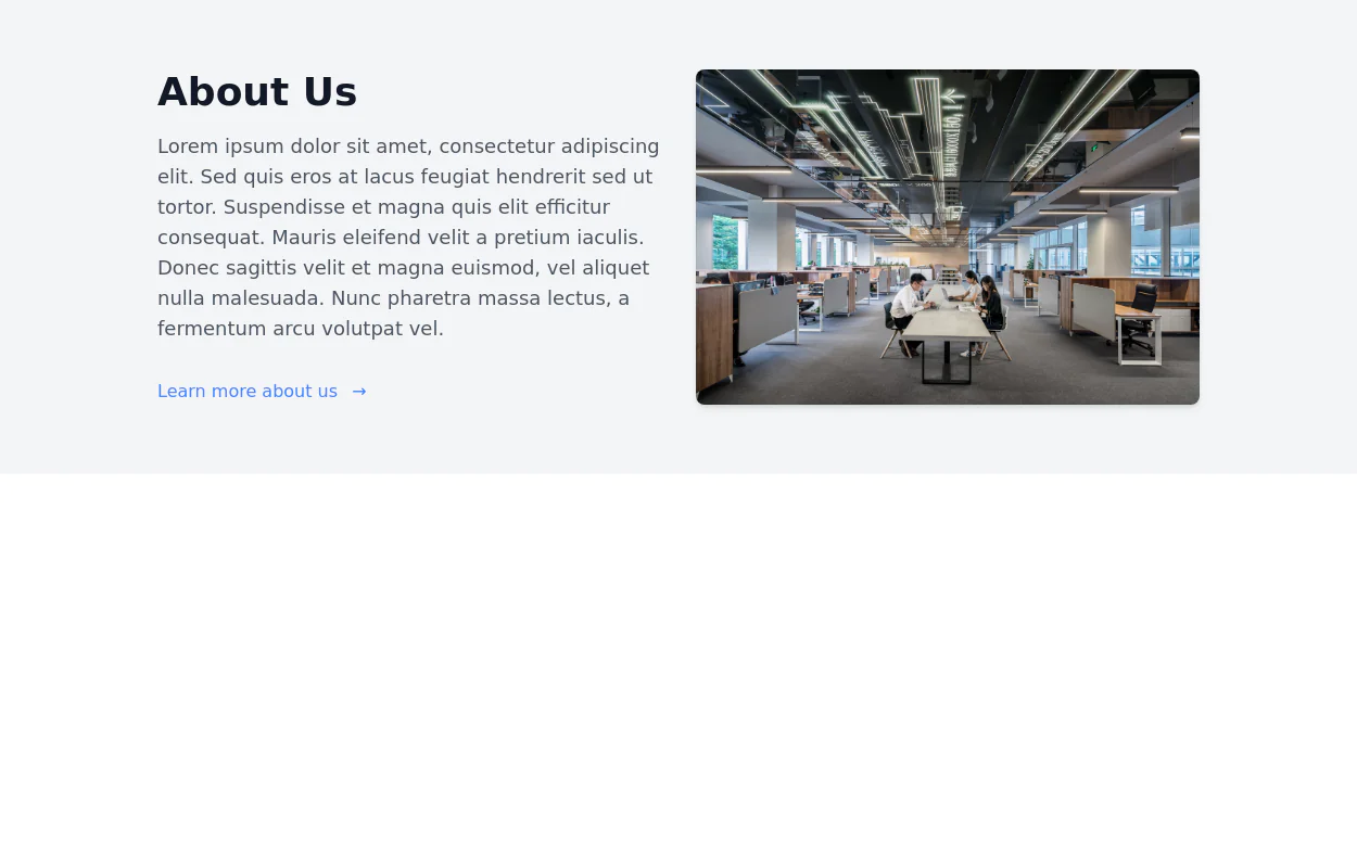
 About Company Section – Animated & Responsive
A modern "About Us" section built with Tailwind CSS and Alpine.js, designed to highlight your company’s story, achievements, and values through a clean and animated layout. This component features smooth scroll animations, responsive design, and a balanced two-column layout — one for text content and one for an image with company stats. It’s perfect for corporate websites, SaaS platforms, or startup landing pages that want to showcase professionalism and credibility. ✨ Key Features Elegant fade-in and slide-up animations using Alpine.js Responsive grid layout optimized for all screen sizes Dark mode support built-in Dynamic stats display (years, team size, countries served) Clean Tailwind CSS design with easy customization
4 months ago473 -
 cards
cardshtml , css ,
9 months ago856 -
 1 year ago2.4k
 -
 Stylish Mobile-First Navigation Bar Using Tailwind
This project showcases a sleek, fixed-top responsive navigation bar crafted with Tailwind CSS. Featuring a vibrant gradient background, a bold uppercase logo, and smooth pink hover effects, it adapts beautifully across devices. On desktop, the navigation links appear horizontally with ample spacing, while on mobile, a hamburger menu toggles a stylish dropdown with rounded corners and subtle shadows. The navbar’s semi-transparent backdrop with blur adds a modern glassmorphism touch, making it perfect for contemporary web designs.
8 months ago729 -
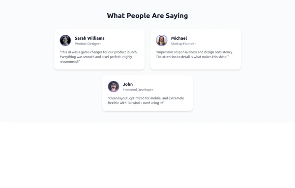 Tailwind Flex Component: Responsive Testimonial Section UI
A clean, modern, and fully responsive Testimonial Section built using Tailwind CSS and Flexbox. Ideal for portfolios, agency websites, SaaS landing pages, or any modern UI project. This reusable component includes user images, job titles, and quotes—perfect for showcasing feedback and adding trust to your UI.
8 months ago978 -
 About - UI Components
Add an About Section to your website or application using Tailwind CSS. These About Sections are easy to use and fully customizable according to your brand's design. These Tailwind UI components are ready to use and customizable.
1 week ago94 -
 2 years ago15k
 -
 1 year ago1.2k
 -
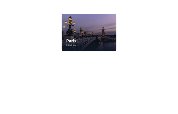
 User about me / introduction card
About me card with an image and a short introduction
3 years ago10.3k -
 canvas fully covers
canvas fully covers
1 year ago4.1k


Explore components by Tags
Didn't find component you were looking for?
Search from 3000+ components