Avant & Après
Avant & Après
This tailwind example is contributed by Omer fils ELENGA, on 30-Nov-2025. Component is made with Tailwind CSS v3. It is responsive. similar terms for this example are Masonry, Image grid

Author Omer fils ELENGA
Related Examples
-
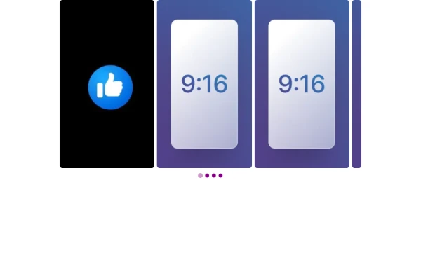
 responsive slider carousel
slider carousel
1 year ago2.5k -
 slider /carousel
simple slider or carousel
10 months ago1.3k -
 Next-Gen Hero Section – Tailwind CSS Component
A stunning, futuristic Hero Section built with Tailwind CSS, designed to capture user attention with glowing animations, smooth gradients, and bold typography. Perfect for modern web apps, education platforms like EduForce, landing pages, or portfolios. This component is responsive, interactive, and visually unique — not commonly found in typical UI libraries.
10 months ago1.3k -
 PrimeCorp | Professional Business Solutions
We deliver cutting-edge business solutions through strategic consulting, tailored services, and continuous support. Partner with us to optimize operations, drive growth, and achieve sustainable success in today's competitive market.
10 months ago969 -
 Next-Gen Hero Section – Tailwind CSS Component
A stunning, futuristic Hero Section built with Tailwind CSS, designed to capture user attention with glowing animations, smooth gradients, and bold typography. Perfect for modern web apps, education platforms like EduForce, landing pages, or portfolios. This component is responsive, interactive, and visually unique — not commonly found in typical UI libraries.
10 months ago1.2k -
 3D Animation Studio
3D animation is the process of creating three-dimensional products, objects, backgrounds, etc., and setting them in motion within a digital environment. It's commonly used for the web, social media marketing, product design, film, cartoons, commercials, and video games.
9 months ago1.7k -
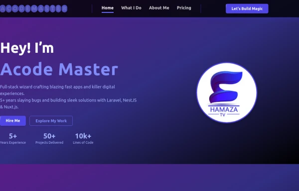
 ACODE MASTER — Cyberpunk Full Stack Developer from Rwanda
"I’m ACODE MASTER — a visionary Full Stack Developer from Rwanda, blending cutting-edge tech with bold design. I specialize in building modern web applications using React, Node.js, and TailwindCSS, inspired by the cyberpunk aesthetic and driven by a passion for digital innovation. Welcome to the future of code."
9 months ago1.6k -
 tinderclone By omerlinks
tinderclone By omerlinks
2 months ago166 -
 Galerie Interactive
Galerie Interactive
2 months ago75 -
 card section neon
card section neon
1 month ago274 -
 ULTIMATE SNAKE
(click to https://quantum-snake.netlify.app/ )ULTIMATE SNAKE is a modern reimagining of the classic Snake game, blending retro gameplay with enhanced visuals, power-ups, and a dynamic difficulty system. Designed for both casual players and high-score chasers, this game brings nostalgia and excitement in every move.
9 months ago1.1k -
 9 months ago1.5k


Explore components by Tags
Didn't find component you were looking for?
Search from 3000+ components