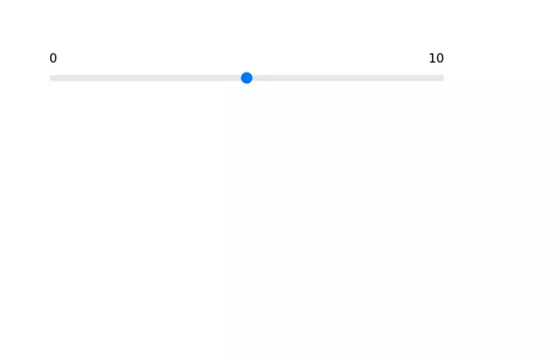
Range Slider
Also, shows the current value of the slider while it is being slid
This tailwind example is contributed by Nikolai, on 11-Mar-2024. Component is made with Tailwind v3.4. It is responsive. It supports dark mode.

Related Examples
-

-
 Range slider
 with upper limit and lower limit.
13.1k -
 14.7k
-
 slider models
Tailwind slider models
1.8k -
 Avant & Après
925 -
 AI Trends Showcase
A clean and modern intelligence feed component for showcasing AI, technology, startup, and research updates with automatic rotation, smooth navigation, and responsive layouts. Perfect For Showcase AI, technology, and innovation stories using a premium editorial-style carousel. Designed with a clean dark aesthetic, automatic slide rotation, interactive breadcrumbs, navigation controls, and a responsive layout that works seamlessly across desktop and mobile devices.
283 -
 responsive slider carousel
slider carousel
3.2k -
 card section neon
1.3k -
 Galerie Interactive
475 -
 Tailwind Customize Slider
Test how to customize slider with tailwind css
3k -
 mobil navigation
1.2k -
 tinderclone By omerlinks
637


Browse by topic
Explore components by Tags
Jump straight to the UI pattern you need.
Can't find it?
Didn't find the component you were looking for?
Search across 3,000+ community-built components and grab the code in seconds.