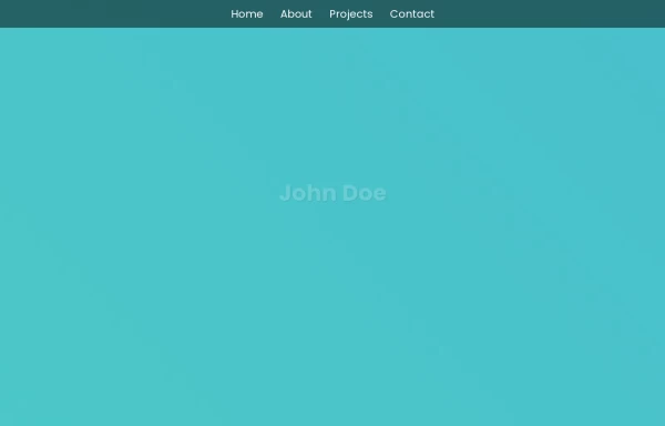
Zoo management
this a navigation bar and hero section of a zoo management system
This tailwind example is contributed by ishimwe shadad, on 26-May-2025. Component is made with Tailwind CSS v3. It is responsive.

Author ishimwe shadad
Related Examples
-
 beautifull portfolio page
I create a portfolio page
1 year ago2.2k -
 Hero $ Navigation
This is a modern, AI-focused landing page for a company called NEURALCORE that offers enterprise-grade AI solutions.
10 months ago1.2k -
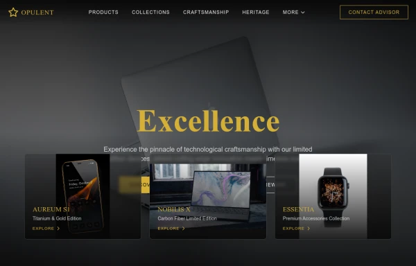 opulent
this a page didicated for laptops,phones using tailwindcss
10 months ago1.2k -
 Frontend Template Open Source Code Website
This frontend template is designed for a website that provides software services and open-source code to users. It serves as a clean, modern UI for browsing, searching, and downloading open-source projects. Building with HTML, tailwindcss for CSS ,
9 months ago1.2k -
 9 months ago1.5k
 -
 9 months ago1.3k
 -
 Rwandan farmers with Canadian markets through sustainable, fair trade practices.
Key Features of This Website: Professional Design: Clean, modern interface with orange/green color scheme representing mangoes and agriculture Fully responsive layout that works on all devices Comprehensive Sections: Hero section highlighting the Rwanda-Canada mango trade Product showcase with different mango varieties Current market pricing table Detailed farm-to-table process explanation Company information and impact metrics Testimonials from partners Contact form and information Trade-Specific Content: Focus on Rwandan mango varieties suitable for Canadian markets Pricing in both USD and kg units common in agricultural trade Information about certifications and compliance Shipping and logistics details User Experience: Clear calls-to-action for quotes and orders Easy navigation between sections Newsletter signup for market updates Contact information prominently displayed Trust Elements: Certifications and compliance badges Impact statistics showing benefits to Rwandan farmers Testimonials from Canadian partners
9 months ago1.2k -
 FLESH & BONE
Stranded in the heart of a cannibal-infested jungle, you must make unthinkable choices to survive. How far will you go to see another sunrise?
4 months ago383 -
 mobil navigation
mobil navigation
3 months ago501 -
 3 months ago553
 -
 3 months ago391
 -
 3 months ago461


Explore components by Tags
Didn't find component you were looking for?
Search from 3000+ components