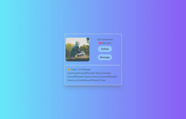
LoveMatch
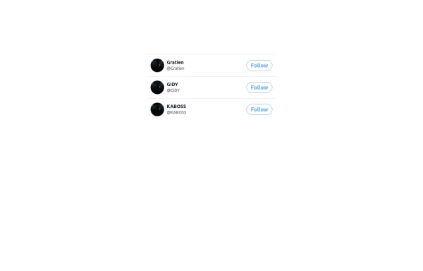
Top Dating Profiles
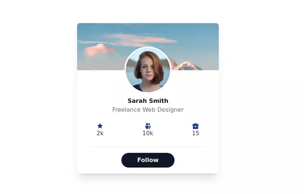
This tailwind example is contributed by ORGIN_DREAMS, on 23-May-2025. Component is made with Tailwind CSS v3. It is responsive. similar terms for this example are Author box, User information

Author ORGIN_DREAMS
Related Examples
-
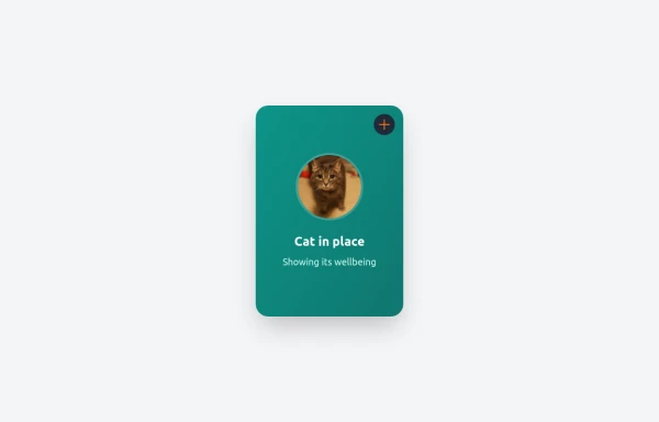
 Simple User Icon
Perfect for dashboard corners or social media platforms. Part of the coastalui.com collection.
11 months ago1k -
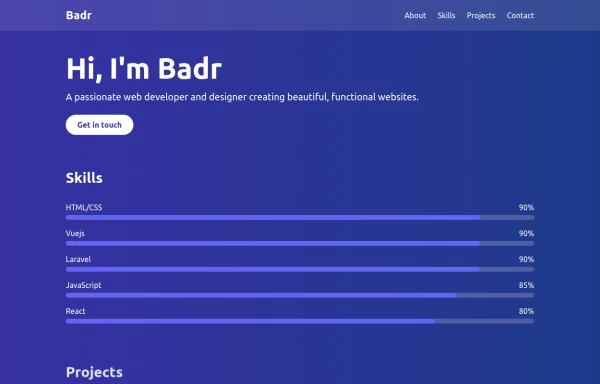
 Responsive Portfolio Webpage with Tailwind CSS
This is a reusable and responsive portfolio webpage template created with HTML and Tailwind CSS. Designed for developers or creatives, the template includes essential sections like Header, Hero, About, Skills, Experience, Projects, Testimonials, Contact Form, and Footer. It features a clean, modern design and is fully customizable without requiring JavaScript. Perfect for showcasing personal or professional work on the web.
1 year ago2.2k -
 3 years ago32.3k
 -
 profile
user profile
8 months ago724 -
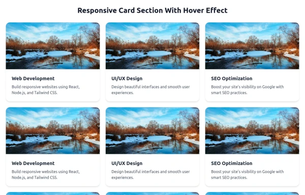 Responsive Card Section With Hover Effect
added more cards with ui friendly
6 months ago582 -
 canvas fully covers
canvas fully covers
8 months ago826 -
 Jobs recommended for you
This HTML page is a responsive, dark-mode-friendly job recommendation interface designed using Tailwind CSS. It displays job listings in a card format, each showing: A colorful header background. A company logo/profile image styled as a rounded thumbnail. A job title (e.g., Senior Product Designer). A company name. A location with an icon. Job type (e.g., Full-time). Time since posting (e.g., 2d ago).
8 months ago633 -
 YouTube Community Post UI Mockup
A static HTML and Tailwind CSS component mimicking the user interface of a YouTube Community Post. This mockup features the channel header (avatar, name, verified badge, timestamp), post content (text and optional media), engagement actions (Like, Dislike, Comment, Share with counts), and the 'Add a comment' section. It's designed to be responsive, supports YouTube's light and dark themes via custom styling, and uses accurate iconography.
9 months ago961 -
 8 months ago1.2k
 -
 Expandable Card
An expandable card using tailwind + alpine to show additional information when it is open
3 months ago384 -
 7 months ago283
 -
 portfolio
This portfolio page for Claire includes: 1. Responsive design that works on both desktop and mobile 2. Indigo-800 and Blue-900 color scheme for the background 3. Dark mode support (the design is already dark-themed) 4. Beautiful animations and effects: 1. Fade-in and slide-up animations for sections 2. Animated skill bars 3. Hover effects on projects and buttons 4. Smooth scrolling for navigation 5. Mobile-friendly navigation with a toggle menu 6. Sections for About, Skills, Projects, and Contact 7. A contact form with styled inputs 8. Social media links in the footer 9. Accessibility considerations (proper heading structure, color contrast, focus styles) Key features: - The background uses a gradient from Indigo-800 to Blue-900 - The header and footer have a frosted glass effect using backdrop filters - Text is white for high contrast against the dark background - Sections fade in and slide up as they enter the viewport - Skill bars animate when the skills section is in view - Project cards have a hover effect with scaling and increased opacity - The contact form has animated focus states - Social media icons change color on hover - The layout is responsive, with a hamburger menu for mobile screens This implementation provides a visually appealing and functional portfolio page for Claire, using HTML, Tailwind CSS, and vanilla JavaScript for the interactions and animations.
1 year ago2.6k


Explore components by Tags
Didn't find component you were looking for?
Search from 3000+ components