Hover Card
This tailwind example is contributed by Maxim, on 09-Jul-2024. Component is made with Tailwind CSS v3. It is responsive.

Author Maxim
Related Examples
-
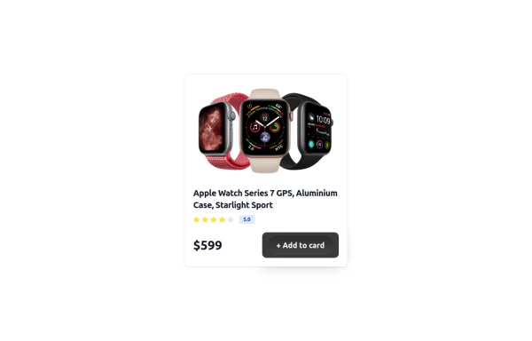
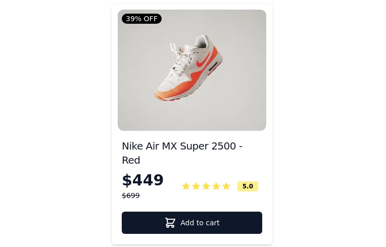 Card-Product
Item or card to show products
1 year ago4.2k -
 2 months ago54
 -
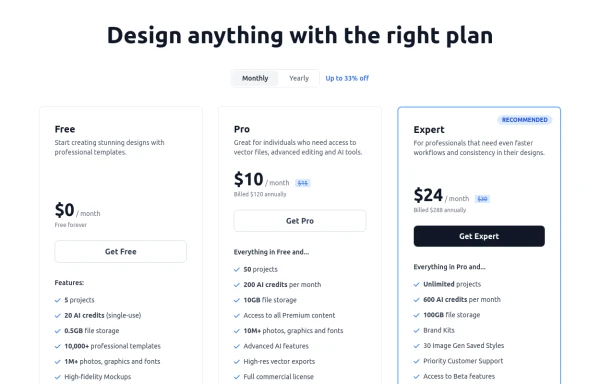 Modern Responsive Pricing Section with Toggle
A sleek, responsive pricing section built with HTML and Tailwind CSS, showcasing three distinct plans (e.g., Free, Pro, Expert) in a card layout. It features a clean monthly/yearly toggle switch with savings indication, highlights a recommended plan with distinct styling and a badge, and uses checkmarks for clear feature comparison. The layout stacks vertically on smaller screens and transitions to a 3-column grid on large screens (lg breakpoint). Includes generic content for easy adaptation and a final "Compare Plans" button.
10 months ago1.1k -
 Card
CardSimple Card
11 months ago946 -
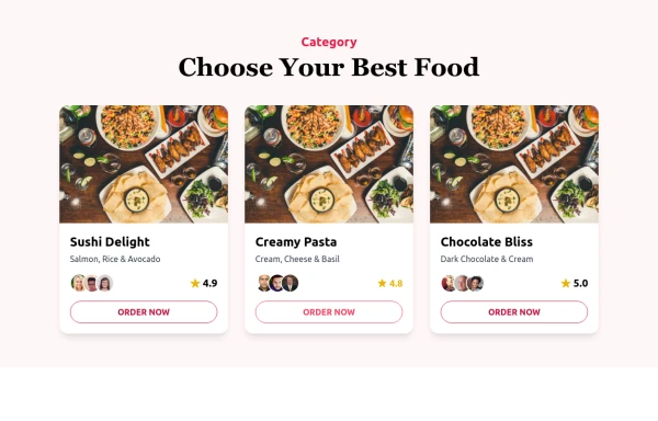 Food Ordering Dashboard
A responsive user interface for selecting and ordering your favorite meals. The dashboard allows users to browse food categories, view dish details, and place orders with ease.
9 months ago1.3k -
 3 years ago11.1k
 -
 Animated Pizza Menu Grid
A beautiful, interactive pizza product grid featuring smooth 360-degree rotation animations on hover. This free open-source component includes automatic dark mode support, responsive design (mobile, tablet, desktop), and an elegant "Add to Cart" button reveal effect. Built with HTML and Tailwind CSS - no dependencies required. Ideal for restaurant websites, food delivery platforms, e-commerce stores, or any product showcase needing eye-catching interactivity.
4 months ago694 -
 3 years ago11.8k
 -
 Latest Blog Card Components
Stay ahead of the curve with fresh content on code, design, startups, and everything in between.
1 month ago89 -
 Profile Card
Responsive modern profile card
1 year ago867 -
 Card
CardCard Layout in Tailwind as React Compoment
1 year ago1.2k -
 MENU OMERLINKS
MENU OMERLINKS
1 month ago145


Explore components by Tags
Didn't find component you were looking for?
Search from 3000+ components