cols-3
This tailwind example is contributed by Maxim, on 08-Feb-2024. Component is made with Tailwind CSS v3. It is responsive.

Author Maxim
Related Examples
-
 Feature Showcase
The feature showcase's responsive grid can also be used as testimonial cards.
2 years ago24.1k -
 Grid
GridGrid Grid-Cards
1 year ago1.8k -
 1 year ago2.1k
 -
 Responsive products grid
Responsive product card grid using tailwind CSS.
2 years ago43.2k -
 Responsive Card Section With Hover Effect
added more cards with ui friendly
1 month ago231 -
 5 months ago351
 -
 Twitter Post (Tweet) UI Mockup
A detailed static HTML and Tailwind CSS component replicating the user interface of a single Twitter post (Tweet). This mockup includes the user avatar, tweet header (name, handle, timestamp), tweet text with styled hashtags/mentions, optional media display, and the action bar with icons and counts (Reply, Retweet, Like, Views, Share). It is responsive, supports light and dark modes, and uses accurate iconography and hover states to closely resemble the real Twitter UI.
4 months ago379 -
 5 months ago887
 -
 Image Classification Models Response Grid
by AI Without Borders
7 months ago801 -
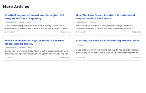 Article List Section
A section displaying a list of articles with associated information.
1 year ago6.6k -
 3 years ago16k
 -
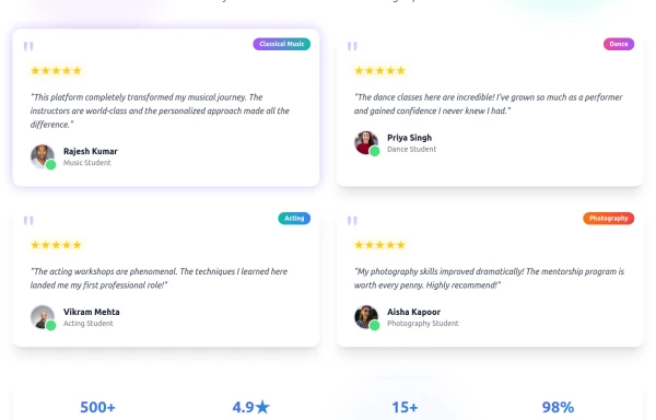 Enhanced Student Testimonials Section
A modern, interactive testimonials section featuring glassmorphism design, floating animations, and social proof elements. Includes star ratings, course badges, user profiles with online status indicators, and a stats section. Built with Tailwind CSS and features gradient backgrounds, hover effects, and responsive design optimized for showcasing student success stories and building credibility.
1 month ago239


Explore components by Tags
Didn't find component you were looking for?
Search from 2400+ components