Team Showcase
This tailwind example is contributed by KULDEEP, on 17-May-2025. Component is made with Tailwind CSS v3. It is responsive. similar terms for this example are Author box, User information

Author KULDEEP
Related Examples
-
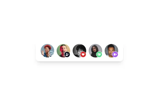 Avatar
Avatar
1 year ago5k -
 Profile, Team or Testimonial
Profile, Team or Testimonial
1 year ago3.9k -
 Responsive portfolio with dark mode
responsive and support dark mode .portfolio website
1 year ago3.9k -
 canvas fully covers
canvas fully covers
1 year ago4.5k -
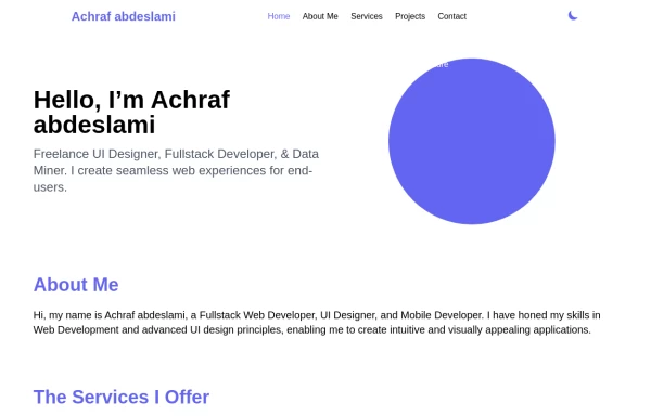
 Responsive Portfolio Webpage with Tailwind CSS
This is a reusable and responsive portfolio webpage template created with HTML and Tailwind CSS. Designed for developers or creatives, the template includes essential sections like Header, Hero, About, Skills, Experience, Projects, Testimonials, Contact Form, and Footer. It features a clean, modern design and is fully customizable without requiring JavaScript. Perfect for showcasing personal or professional work on the web.
1 year ago2.5k -
 DailyDev Card
Card -based card used in the Dailydev Card, this is created to be modified to taste of each user
1 year ago1.9k -
 canvas fully covers
canvas fully covers
10 months ago1k -
 Jobs recommended for you
This HTML page is a responsive, dark-mode-friendly job recommendation interface designed using Tailwind CSS. It displays job listings in a card format, each showing: A colorful header background. A company logo/profile image styled as a rounded thumbnail. A job title (e.g., Senior Product Designer). A company name. A location with an icon. Job type (e.g., Full-time). Time since posting (e.g., 2d ago).
10 months ago716 -
 9 months ago1k
 -
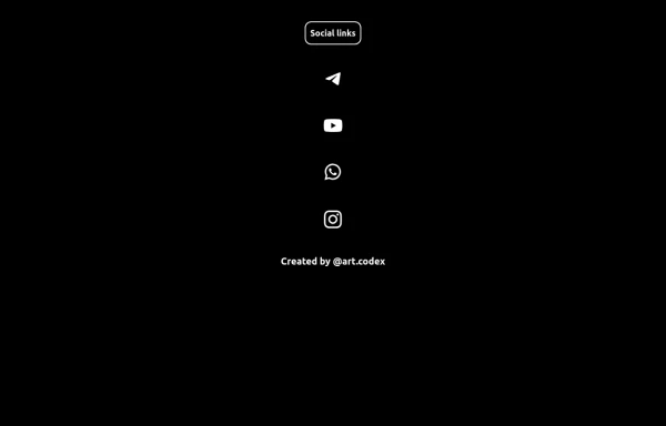 Social Media
Social Media button vertical dark style
6 months ago542 -
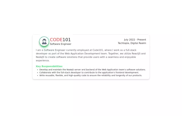 Experience Card
Experience card section you can use for portfolio or other profiles.
2 years ago4.1k -
 High-Performance Hotel Operations & AI Agent Testing Dashboard
A sophisticated, real-time command center designed for modern hotel management. This dashboard features deep integration for monitoring AI agent performance, guest sentiment, and room occupancy. Built with a "Mobile-First" philosophy, it demonstrates advanced data visualization, glassmorphism UI design, and a centralized state-management architecture. Perfect for showcasing full-stack capabilities in AI-driven automation.
1 month ago280


Explore components by Tags
Didn't find component you were looking for?
Search from 3000+ components