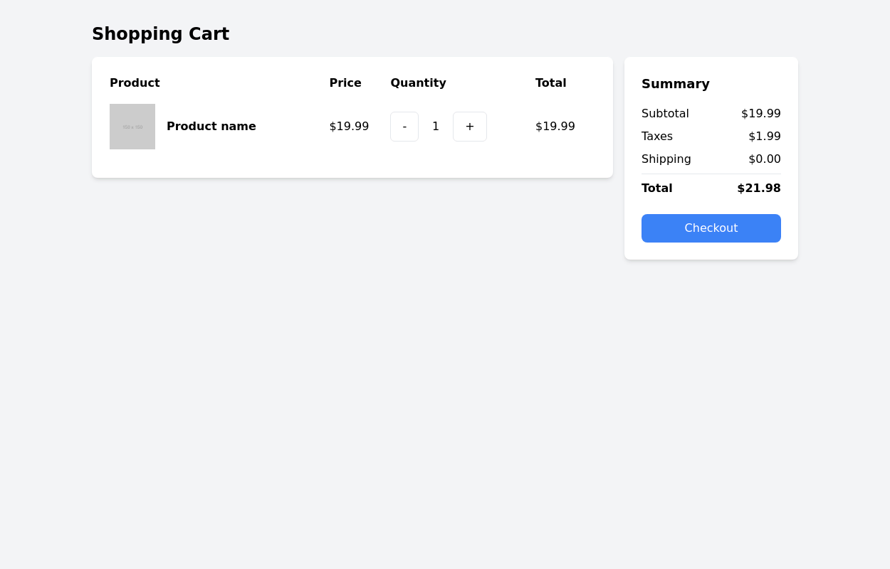
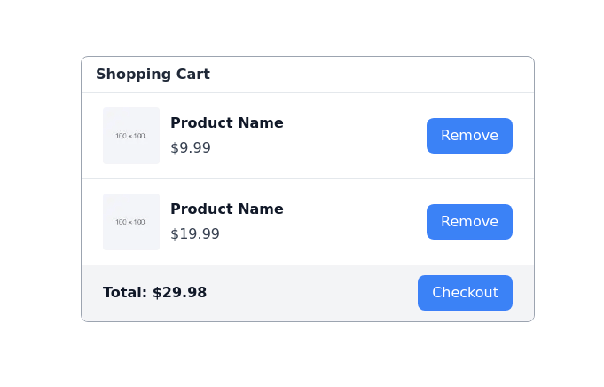
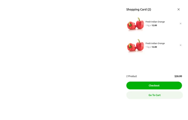
Checkout card
This tailwind example is contributed by JaxStone, on 07-Mar-2023. Component is made with Tailwind CSS v3. It is responsive.

Author JaxStone
Related Examples
-
 3 years ago24.1k
 -
 3 years ago16.1k
 -
 3 years ago13.4k
 -
 3 years ago16.2k
 -
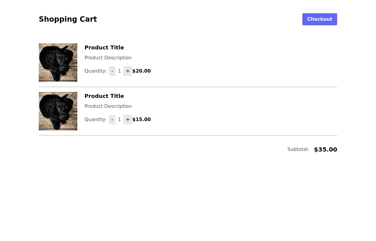
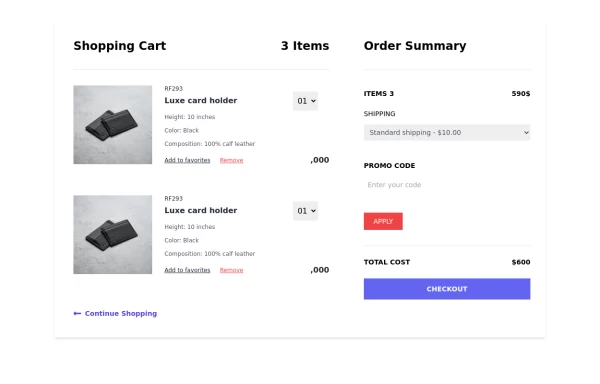 Shopping cart page
this is the responsible shopping cart page
2 years ago8.3k -
 Animated Pizza Menu Grid
A beautiful, interactive pizza product grid featuring smooth 360-degree rotation animations on hover. This free open-source component includes automatic dark mode support, responsive design (mobile, tablet, desktop), and an elegant "Add to Cart" button reveal effect. Built with HTML and Tailwind CSS - no dependencies required. Ideal for restaurant websites, food delivery platforms, e-commerce stores, or any product showcase needing eye-catching interactivity.
4 months ago693 -
 1 year ago1.3k
 -
 shopp of shoes
shopp style
9 months ago1.2k -
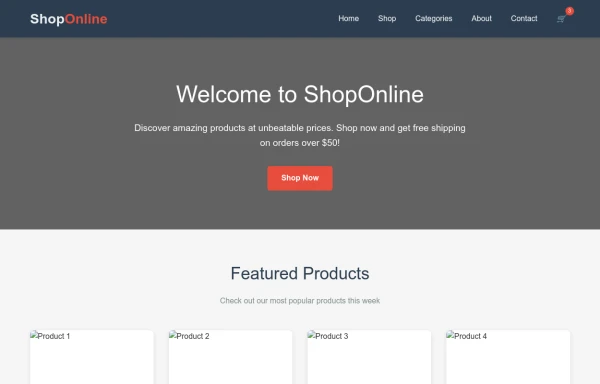 shopping
Online shopping will help us find the things we want using our phone or computer and have them delivered to us.
9 months ago1.1k -
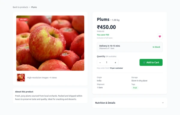 Product Details Page
This section will show all the information about a selected product, including its title, description, price, images, and specifications.
6 months ago1.1k -
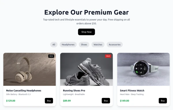 Shop Now Amazon x
Product cards
9 months ago1.5k -
 9 months ago1.1k


Explore components by Tags
Didn't find component you were looking for?
Search from 3000+ components