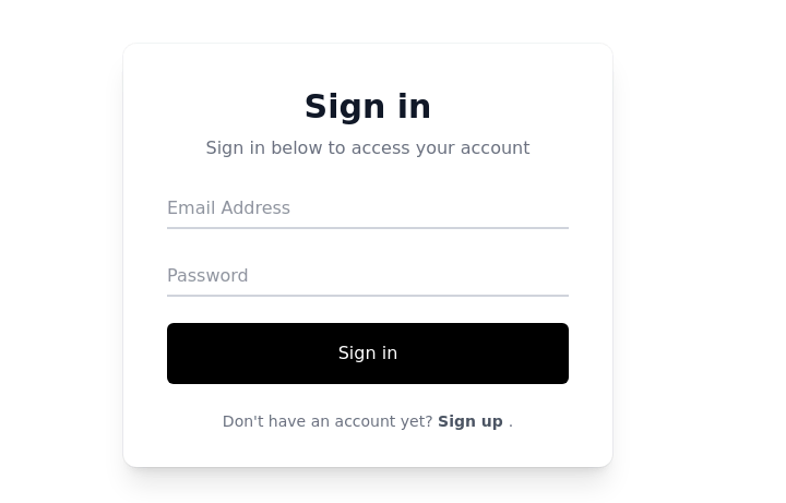
- Home
-
Login Form
Login Form
Bigger input field Login form. like bootstrap input-lg
This tailwind example is contributed by muhittin budak, on 11-Apr-2025. Component is made with Tailwind CSS v3. It is responsive. similar terms for this example are Register, Sign in
Author muhittin budak
Related Examples
-
Extreme Signup Page
I create a signup page using html, tailwindcss and font awesome icons using cdn.
1 year ago3k -
Amazing 3D Login and Registiration Aniamation Form
create a stunning 3D animated background with floating geometric shapes, particle effects, and interactive elements using React, Three.js, and Tailwind CSS. This will be fully responsive and visually captivating.
8 months ago1.1k -
login
login
4 months ago648 -
Multi-Step Form with Progress Tracker
sleek and interactive multi-step registration form built with Tailwind CSS and Alpine.js, perfect for onboarding users through a smooth, step-by-step experience. This component enhances user engagement with animated transitions, real-time validation, and a dynamic progress bar that visually tracks completion. Itβs fully responsive, dark-mode ready, and ideal for modern SaaS applications, startup landing pages, or authentication systems. β¨ Key Features πͺ Three-step flow: Personal Info β Account Setup β Preferences β‘ Real-time field validation with instant feedback π Password visibility toggles for better UX π Progress bar tracker with smooth animations β Success confirmation with user details preview π Dark mode support for modern UI design π¨ Alpine.js-powered interactivity β no external JS frameworks needed π± Fully responsive design optimized for all devices π‘ Perfect for: SaaS or startup registration flows Onboarding or sign-up pages Form builders, dashboard templates, or web app UIs UI component libraries & code snippets collections
4 months ago597 -
2 years ago25k
-
Responsive registration form
form with social login buttons
2 years ago29.2k -
Login with google provider
10 months ago1.3k -
Login Form
Color Updates: - Changed background to gradient `from-indigo-800 to-blue-900` - Updated text colors to match the new theme - Updated button and interactive element colors - Added dark mode color variants Enhanced Styling: - Added gradient background - Increased padding and spacing - Improved border radius to `rounded-xl` - Added hover scale effects - Enhanced shadow with `shadow-2xl` Added Animations: - Fade-in animation on load - Scale transition on card hover - Button ripple effect on click - Smooth transitions for all interactive elements Improved Dark Mode: - Enhanced dark mode colors - Added system preference detection - Improved dark mode contrast - Added dark mode specific focus rings Enhanced Functionality: - Added basic form validation - Added ripple effect on button click - Improved hover and focus states - Added transition animations Accessibility Improvements: - Maintained proper contrast ratios - Enhanced focus states - Added proper ARIA attributes - Improved form labels
1 year ago2.2k -
Simple Login Page
This component is responsive for Mobile & Desktop & Dark mode Supported.
1 year ago3.4k -
Register Form
This is a simple Register Form component with dark mode supported and mobile responsive
1 year ago3.7k -
Login screen
Reward login screen
5 months ago251 -
Login Form
Admin Login Form
1 year ago2.3k
Explore components by Tags
Didn't find component you were looking for?
Search from 3000+ components