iframe profile card contact form scratch card to reveal email address
iframe profile card contact form scratch card to reveal email address
This tailwind example is contributed by Geoffrey Callaghan, on 17-Feb-2024. Component is made with Tailwind CSS v3. It is responsive.

Author Geoffrey Callaghan
Related Examples
-
 background animation
background animation
1 month ago169 -
 6 months ago1.1k
 -
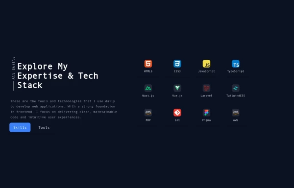 Reusable Skill Showcase Section With Pure Tailwind CSS
A fully responsive and modular "Skills & Tools" section, perfect for any developer portfolio. Built with static HTML and Tailwind CSS, this component can be easily integrated into any project and made dynamic using any frontend framework (Vue, React, Svelte, Angular) or vanilla JavaScript. Customize it to highlight your unique tech stack and create engaging portfolio pages.
9 months ago1.8k -
 invoice 02
product invoice
8 months ago669 -
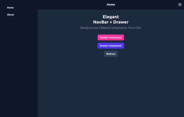 Elegant NavBar + Drawer
A NavBar, a responsive drawer/sidebar, and other useful Tailwind components to get started creating an app. Pure CSS, no JavaScript needed (although this example uses a bit of JS).
8 months ago1.3k -
 1 month ago270
 -
 CTA Responsive
Gradient Style CTA
6 months ago424 -
 3 years ago10.1k
 -
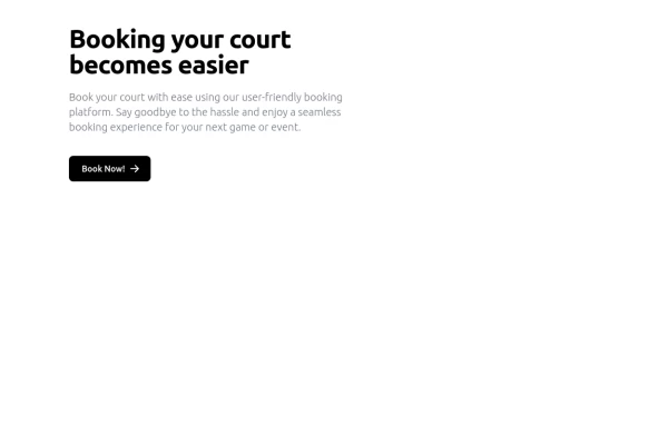 Simple Hero Section
Hero Section using Tailwind
11 months ago1.2k -
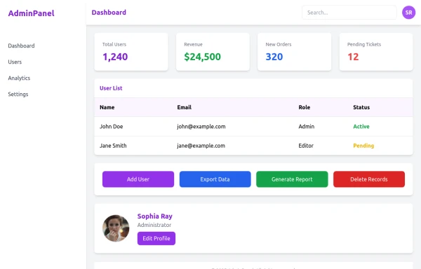 admin panel UI
Premium Admin Panel Pack including sidebar navigation, top navbar, dashboard cards, user tables, quick actions, profile section, and footer. Fully responsive with modern clean design using Tailwind CSS.
6 months ago1.7k -
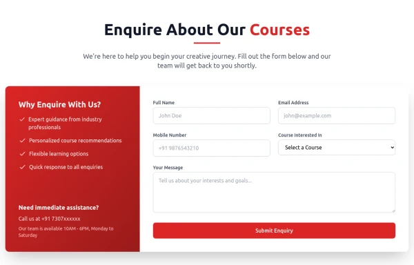
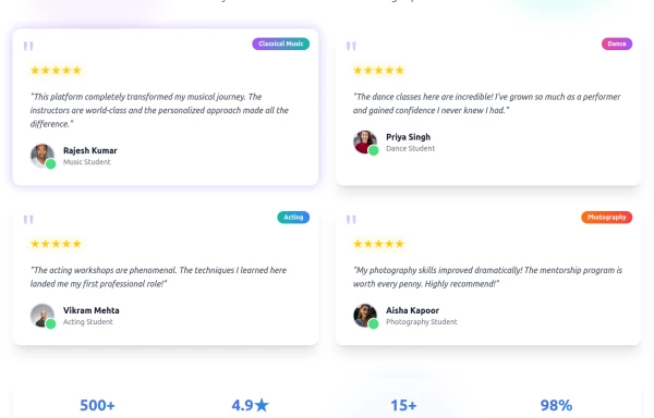 Enhanced Student Testimonials Section
A modern, interactive testimonials section featuring glassmorphism design, floating animations, and social proof elements. Includes star ratings, course badges, user profiles with online status indicators, and a stats section. Built with Tailwind CSS and features gradient backgrounds, hover effects, and responsive design optimized for showcasing student success stories and building credibility.
5 months ago548 -
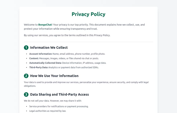 Privacy Policy
Privacy Policy
1 year ago1.1k


Explore components by Tags
Didn't find component you were looking for?
Search from 3000+ components