Card
New type Card and premium card.
This tailwind example is contributed by Arjun Kumar, on 04-May-2026. Component is made with Tailwind v3.4. It is responsive. It supports dark mode. similar terms for this example are CTA,banner

Related Examples
-
 Call to Action (for app stores)
Download app section with Playstore and Appstore button
12.2k -
 9.7k
9.7k -
 Modern CTA section
CTA with background patterns
-
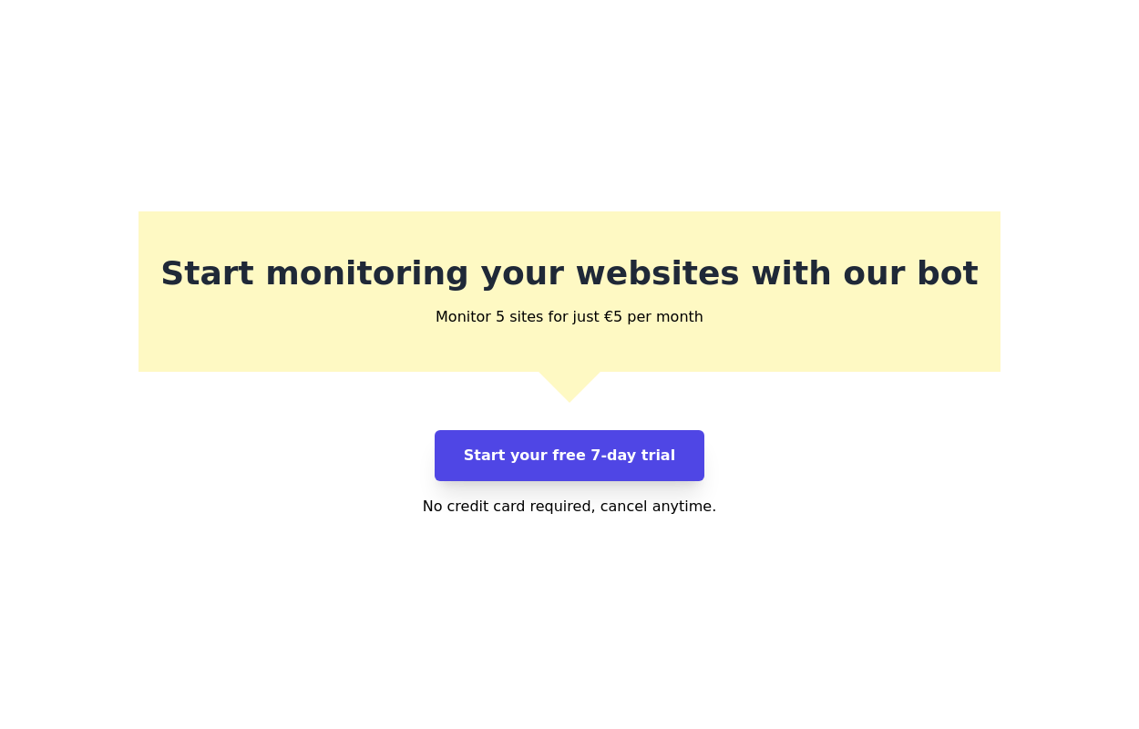 Call to action component
Start your free 7-day trial Call to action button
8.5k -
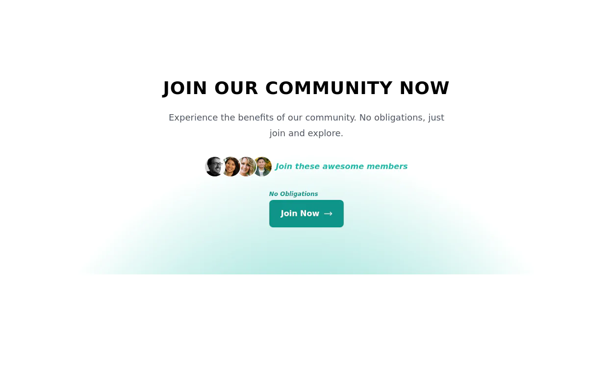 Join Our Community Banner
Encourage users to become members of a community.
9k -
 SaaS Feature Section
It has a Gradient text headline and CTA buttons
10.1k -
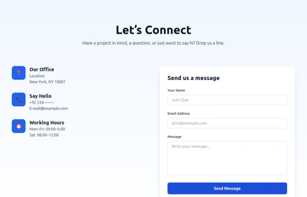 Modern Contact Section with Responsive Grid and Glassmorphic Form
A clean, professional contact section with a dual-column layout featuring contact details and a sleek glassmorphism-inspired form. Fully responsive with Tailwind CSS, supporting both light and dark modes.
-
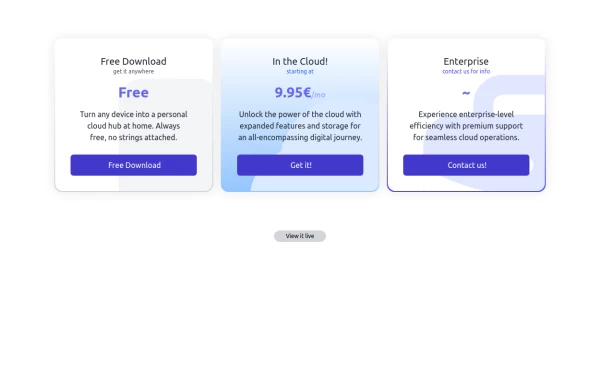 Interactive Pricing Table
This modern pricing component features a visually appealing, responsive layout with smooth hover effects, making it ideal for showcasing different plans and subscription tiers. Design and Features: ✅ Elegant Gradient Backgrounds • Each pricing card has a unique gradient overlay, transitioning from soft gray, blue, or indigo to white, enhancing contrast and visual appeal. • The rounded-2xl design ensures a polished and smooth aesthetic. ✅ Interactive Hover Effects • Cards have a subtle hover shadow enhancement, making them pop on interaction (hover:shadow-[0_0px_25px_0px_rgba(0,0,0,0.2)]). • Slight floating effect (hover:translate-y-[-5px]) gives the illusion of elevation on hover. ✅ Pricing & Plan Details • Each card presents a plan title, a short subtitle, and a bold price display (text-3xl font-extrabold text-indigo-500). • Supports free, subscription-based, and enterprise-tier pricing, ensuring flexibility for different business models. ✅ Call-to-Action Buttons • Each plan features a highly visible CTA button (bg-indigo-700 text-white rounded-md). • The buttons change color on hover (hover:bg-indigo-500) and expand slightly, encouraging user interaction. ✅ Animated Background Icons • A large, transparent icon (text-[500px] text-gray-100) dynamically moves on hover (group-hover:-translate-y-8 group-hover:-translate-x-8), adding depth and a premium feel. This pricing component is perfect for SaaS platforms, digital subscriptions, and service offerings, ensuring a modern, sleek, and engaging user experience. 🚀
2.1k -

-
 GamingOnline
used to pray game online
1.7k -
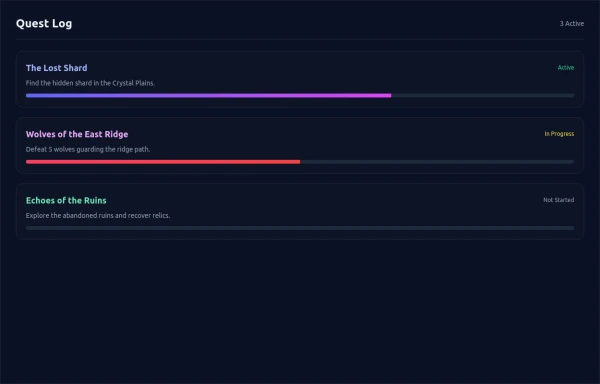 asimple game Quest Log
asimple game lay out Quest Log
1.1k -





Browse by topic
Explore components by Tags
Jump straight to the UI pattern you need.
Can't find it?
Didn't find the component you were looking for?
Search across 3,000+ community-built components and grab the code in seconds.