register
This tailwind example is contributed by Anonymous, on 17-Oct-2026. Component is made with Tailwind v3.4. It is responsive.

Related Examples
-

-
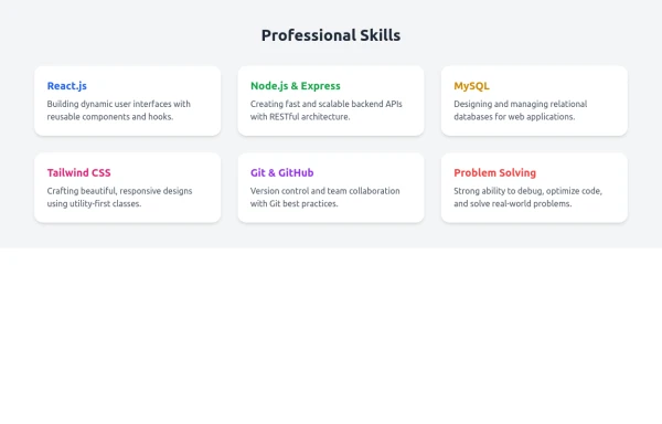 Skill Cards with Tailwind CSS
A responsive and modern card section designed with Tailwind CSS to showcase professional skills. Each card features a smooth fade-in animation and hover scaling effect for an engaging user experience. Ideal for portfolio websites, developer profiles, and personal branding pages. Fully customizable and mobile-friendly.
1.5k -
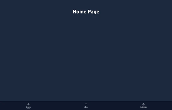 Elegant Dock
Useful Tailwind classes for constructing a basic Dock (usually used on mobile).
1.4k -
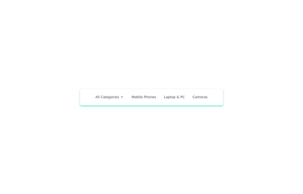 navigation header
responsive navigation header
3.5k -
 Live Chat Component using Tailwind Alpine JS
1.3k -
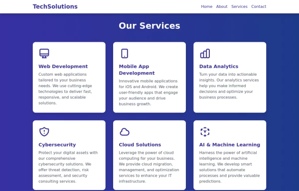 Services
This Services page design includes: 1. Responsive layout using Tailwind CSS grid system 2. Indigo-800 and Blue-900 color scheme 3. Dark mode support 4. Header with navigation 5. Six service cards with icons, titles, and descriptions 6. Footer with copyright information 7. Subtle animations and transitions 8. Accessibility considerations (proper heading structure, color contrast) Key features: - The background uses a gradient from Indigo-800 to Blue-900 - The header and footer have a white background in light mode and dark gray in dark mode - Service cards have a white background in light mode and dark gray in dark mode - Text colors are adjusted for readability in both light and dark modes - Icons use the Indigo-800 color (Indigo-400 in dark mode) for consistency - Each service card has a hover effect that scales it up slightly - Service cards fade in with a staggered delay for a smooth entrance - Dark mode is automatically applied based on system preferences - The design is fully responsive, adjusting from 1 to 3 columns based on screen size This design provides a clean, professional look for a services page while incorporating the requested color scheme and maintaining good usability across different devices and color modes.
2.9k -
 Soft-Modern Dark Pricing
A sophisticated, highly rounded pricing component inspired by modern fintech interfaces. It avoids harsh lines in favor of deep "zinc" tones and subtle borders (border-white/5). The center card pops using a high-contrast white button against the dark theme, guiding user focus naturally without using aggressive gradients.
789 -
 Gradient Flip-Text Button with Hover Animation
This stylish button features a dynamic gradient background that shifts from a calm green gradient by default to a vibrant purple-pink-red gradient on hover. The button also includes an interactive text flip effect, where the text seamlessly transitions on hover, creating a visually appealing and modern UI element. Perfect for adding flair to your websites or applications while maintaining functionality and responsiveness.
2.4k -
 chat ui advanced
Professional chat ui, connect me for jsx https://abhirajk.vercel.app/
2.5k -
 Sidebar
This is the sidebar that I use in my projects, I use grid to be able to manage the space issue a little better, it seems like a clean and modern design, it is more than anything for the dashboards that you want to create
4.7k -

-
 961






Browse by topic
Explore components by Tags
Jump straight to the UI pattern you need.
Can't find it?
Didn't find the component you were looking for?
Search across 3,000+ community-built components and grab the code in seconds.