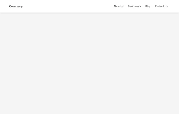
Navbar
Navbar for primary menu
This tailwind example is contributed by Anonymous, on 12-Apr-2024. Component is made with Tailwind CSS v3. It is responsive. It supports dark mode.

Author Anonymous
Related Examples
-
 3 years ago27.6k
 -
 Responsive navbar
navbar with the dropdown on mobile devices
3 years ago38.6k -
Responsive Navbar Example
A working example of the navbar
3 years ago17.3k -
Animated Drawer
Collapsible sidebar navigation that allows users to access additional menu options. It is designed for efficient space utilization and can be easily expanded and collapsed.
2 years ago28.1k -
 2 years ago10.2k
 -
 Responsive navbar with dark mode support
Sidebar on small screen devices
3 years ago19.7k -
 Navbar Section
Responsive Navbar
3 years ago23.6k -
 3 years ago62.1k
 -
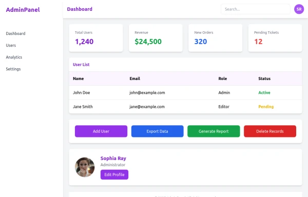 admin panel UI
Premium Admin Panel Pack including sidebar navigation, top navbar, dashboard cards, user tables, quick actions, profile section, and footer. Fully responsive with modern clean design using Tailwind CSS.
9 months ago1.9k -
 omerlinkStream
omerlinkStream
2 months ago532 -
 Responsive Navbar with TailwindCSS
responsive navbar built with TailwindCSS, perfect for mobile and desktop views
1 year ago1.8k -
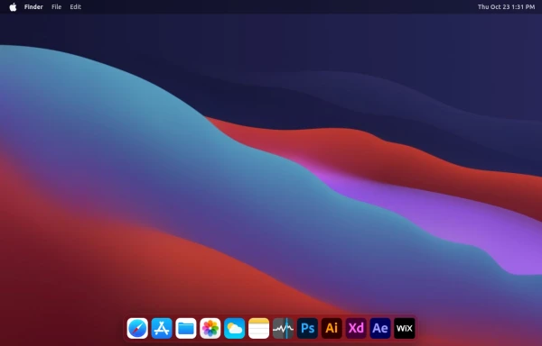 macOS Style Webpage – macOS Design in the Browser
A simple webpage inspired by the macOS interface. It recreates the clean design, dock, and desktop look of macOS using only HTML, tailwind CSS, and JavaScript. This project focuses on front-end styling and layout to bring the visual feel of macOS to the web — not a full simulation, just the look and vibe.
5 months ago1.3k


Explore components by Tags
Didn't find component you were looking for?
Search from 3000+ components