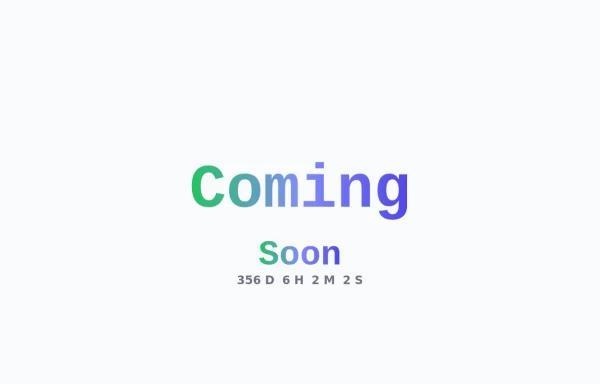
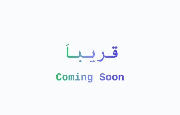
Animated Coming Soon Page 1
animated coming soon landing page
This tailwind example is contributed by Anonymous, on 11-Jul-2024. Component is made with Tailwind CSS v3. It is responsive. It supports dark mode. similar terms for this example are Front page,upcoming, Pre-launch page, Teaser page, Under construction page, Placeholder page, Sneak peek page,Launch page

Author Anonymous
Related Examples
-
 Animated Coming Soon Page 1
animated coming soon landing page
1 year ago4.2k -
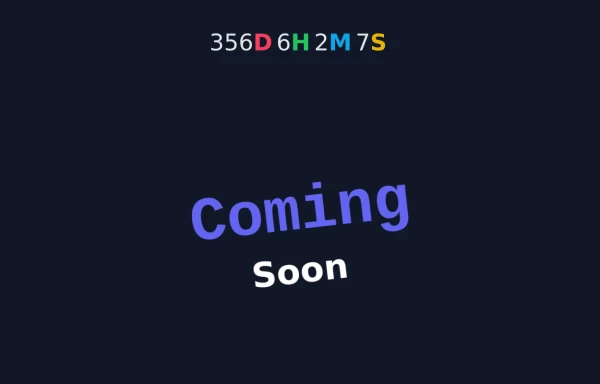 Animated Coming Soon Page 2
Animated Coming soon Page
1 year ago3.9k -
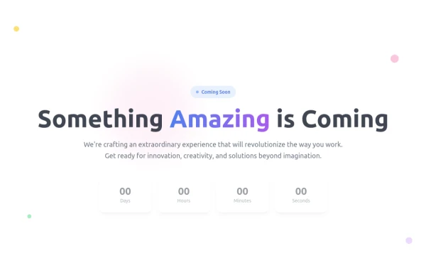
 Coming Soon Page
Modern , gradient coming soon page
1 year ago2.1k -
 Animated Coming Soon Page 1
animated coming soon landing page
1 year ago879 -
 Clean AI Chat UI with Tailwind CSS – ChatGPT-Style Interface
A polished and responsive AI chat interface built using modern Web Components and Tailwind CSS. This UI replicates the smooth, minimal experience of ChatGPT with a clean layout, floating input bar, animated scrollable message feed, and mock AI responses. Ideal for SaaS dashboards, AI assistants, or frontend prototypes. Designed with professional spacing, accessible colors, and reusable components. Key features: Responsive layout with mobile support Floating input bar with auto-expanding textarea Tailwind-powered message bubbles with clear sender roles Modern dark theme with subtle gradients and shadows Easily extendable to real AI APIs (e.g., OpenAI)
10 months ago2k -
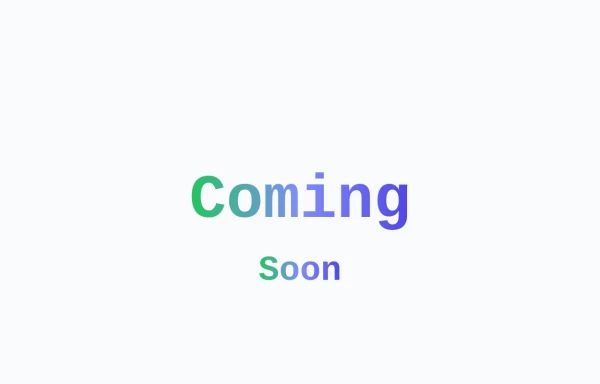
 Animated Coming Soon Page 1
animated coming soon landing page
9 months ago801 -
 SomaRwanda
Menya uburyo bwo kwandika ibisomwa, impuzandimi, n'imyandikire y'icyongereza mu buryo bworoshye.
9 months ago1.1k -
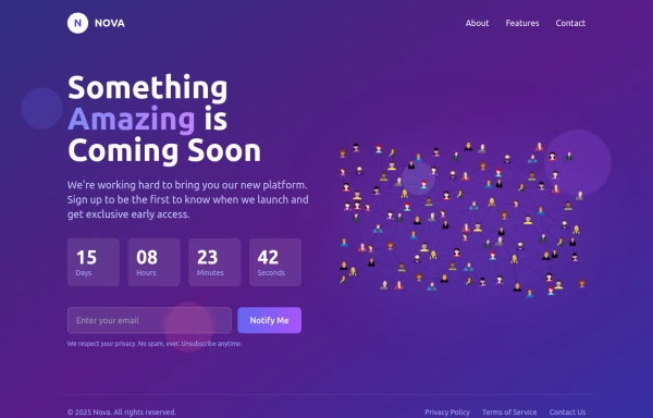
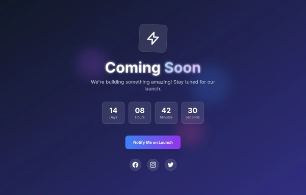
 Coming Soon Countdown Section – Animated & Responsive
A beautifully designed "Coming Soon" landing section built with Tailwind CSS and Alpine.js, perfect for startups, SaaS platforms, and product launches. This component features a live countdown timer, smooth fade-in animations, and floating gradient effects for a futuristic, engaging look. The layout adapts seamlessly to all screen sizes and supports dark mode, creating a professional pre-launch experience that builds anticipation and excitement. ✨ Key Features ⏳ Dynamic countdown timer (days, hours, minutes, seconds) 🎨 Animated gradient orbs for a vibrant background effect 🌙 Dark mode support included 💨 Smooth entrance animations using Alpine.js 📱 Fully responsive design for all devices 🔗 Social media icons to keep your audience connected 💡 Perfect for: Coming Soon or Under Construction pages Product and SaaS pre-launch sites Portfolio or agency landing pages Event or app launch countdowns
5 months ago737 -
 Coming Soon Countdown Section – Animated & Responsive
A beautifully designed "Coming Soon" landing section built with Tailwind CSS and Alpine.js, perfect for startups, SaaS platforms, and product launches. This component features a live countdown timer, smooth fade-in animations, and floating gradient effects for a futuristic, engaging look. The layout adapts seamlessly to all screen sizes and supports dark mode, creating a professional pre-launch experience that builds anticipation and excitement. ✨ Key Features ⏳ Dynamic countdown timer (days, hours, minutes, seconds) 🎨 Animated gradient orbs for a vibrant background effect 🌙 Dark mode support included 💨 Smooth entrance animations using Alpine.js 📱 Fully responsive design for all devices 🔗 Social media icons to keep your audience connected 💡 Perfect for: Coming Soon or Under Construction pages Product and SaaS pre-launch sites Portfolio or agency landing pages Event or app launch countdowns
4 months ago295 -
 Caming Soon page design
coming soom page design
3 months ago344 -
 1 year ago4.1k
 -
 3D Coming Soon Page
Here’s a modern, interactive 3D "Coming Soon" page built with Tailwind CSS, featuring floating elements, glass morphism, and subtle animations. Perfect for product launches, portfolios, or SaaS pre-launch pages
10 months ago1.2k


Explore components by Tags
Didn't find component you were looking for?
Search from 3000+ components