Class A Profile - Information Systems Study Program
Digital Innovation
The Future Starts Here.
This tailwind example is contributed by Alif Bima Pradana, on 10-Mar-2026. Component is made with Tailwind v3.4. It is responsive. It supports dark mode. similar terms for this example is Front page

Related Examples
-
-
 Eduplay
Turn screen time into fun learning time
-
-
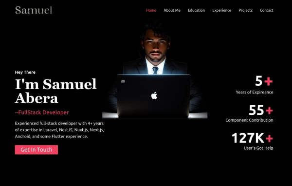 Portfolio Hero Section 3
visually stunning and captivating hero section component for your portfolio website.
9.8k -
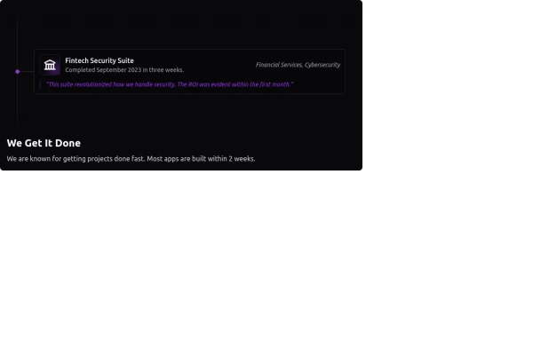 Fully Animated Timeline Card
It is at a 20s interval for testing purposes. Go to the <style> and change the .content-scroll class from 20s to 35s for a production ready slower animation.
2.8k -
 about video
about kelaplus video
1.2k -
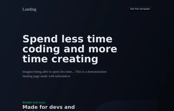 Landing Page Template
source https://github.com/gary149/tailwindcss-landing-gradients/blob/master/index.html
17k -
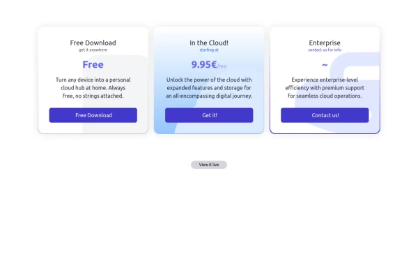 Interactive Pricing Table
This modern pricing component features a visually appealing, responsive layout with smooth hover effects, making it ideal for showcasing different plans and subscription tiers. Design and Features: ✅ Elegant Gradient Backgrounds • Each pricing card has a unique gradient overlay, transitioning from soft gray, blue, or indigo to white, enhancing contrast and visual appeal. • The rounded-2xl design ensures a polished and smooth aesthetic. ✅ Interactive Hover Effects • Cards have a subtle hover shadow enhancement, making them pop on interaction (hover:shadow-[0_0px_25px_0px_rgba(0,0,0,0.2)]). • Slight floating effect (hover:translate-y-[-5px]) gives the illusion of elevation on hover. ✅ Pricing & Plan Details • Each card presents a plan title, a short subtitle, and a bold price display (text-3xl font-extrabold text-indigo-500). • Supports free, subscription-based, and enterprise-tier pricing, ensuring flexibility for different business models. ✅ Call-to-Action Buttons • Each plan features a highly visible CTA button (bg-indigo-700 text-white rounded-md). • The buttons change color on hover (hover:bg-indigo-500) and expand slightly, encouraging user interaction. ✅ Animated Background Icons • A large, transparent icon (text-[500px] text-gray-100) dynamically moves on hover (group-hover:-translate-y-8 group-hover:-translate-x-8), adding depth and a premium feel. This pricing component is perfect for SaaS platforms, digital subscriptions, and service offerings, ensuring a modern, sleek, and engaging user experience. 🚀
2.1k -
 tinderclone By omerlinks
tinderclone By omerlinks
636 -
 Bongo IT Company — Innovate. Transform. Succeed.
Bongo IT Company — Innovate. Transform. Succeed.
-
 Digital Village - Red and White Building the Nation
Landing page website village
-
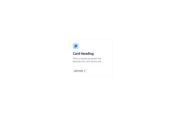 Feature Card
Shows off a feature, great for homepages and grid layout, or can be used in dashboards for "example use" grids. Enjoy! Part of the Coastal UI collection.
791







Browse by topic
Explore components by Tags
Jump straight to the UI pattern you need.
Can't find it?
Didn't find the component you were looking for?
Search across 3,000+ community-built components and grab the code in seconds.