sidebar
sidebar
This tailwind example is contributed by aditya_sharma, on 30-Jul-2026. Component is made with Tailwind v3.4. It is responsive. similar terms for this example is drawer

Related Examples
-
 Creative Agency Navbar with Fullscreen Mobile Menu & Animated CTA
A bold, editorial-style navigation bar designed for creative agencies, design studios, architecture firms, and portfolio websites. Built with pure HTML and Tailwind CSS, it features a minimalist branding system, fullscreen mobile navigation, animated call-to-action button, responsive layout, and modern typography inspired by premium digital agencies.
325 -
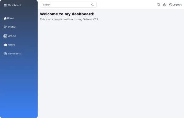 Tailwind Sidebar Layout
Place edited for the search button
-

-

-
 Sticky Navbar
A modern, feature-rich, and fully responsive navigation bar built with Tailwind CSS. This premium navbar includes a top contact bar, multi-level mega menus, live search with suggestions, mobile drawer navigation, nested accordion menus, authentication buttons, sticky header, and smooth interactions. Perfect for SaaS, corporate, startup, agency, eCommerce, legal, education, and business websites.
281 -
 Ecommerce Navbar with products, Expanding Search & Mobile sidebar filter
luxury ecommerce navigation bar crafted with pure HTML and Tailwind CSS.
232 -
 Responsive navbar with alpinejs
A mix of Penguin navbar with PineUI Slide-Over
-
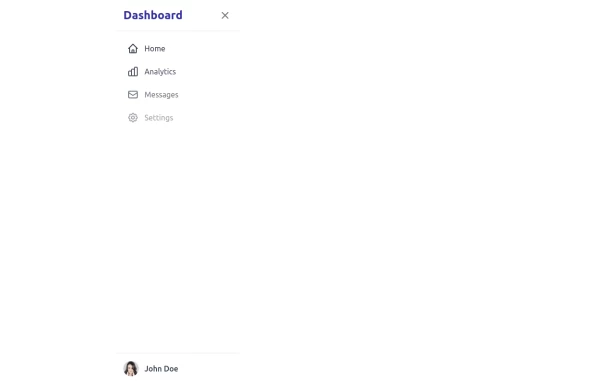 sidebar
This sidebar implementation includes: 1. Responsive design that works on both desktop and mobile 2. Indigo-800 and Blue-900 color scheme for the background 3. Dark mode support 4. Beautiful animations and effects: 1. Slide-in animation when opening the sidebar 2. Fade-in animation for menu items with staggered delays 3. Hover effects on menu items with underline animation 4. Smooth color transitions 5. SVG icons for menu items 6. User profile section at the bottom of the sidebar 7. Close button for easy dismissal on mobile 8. Main content area with a toggle button for the sidebar 9. Accessibility considerations (proper heading structure, color contrast, focus styles) Key features: - The background uses a gradient from Indigo-800 to Blue-900 - The sidebar has a white background in light mode and dark gray in dark mode - Text colors are adjusted for readability in both light and dark modes - Menu items have hover effects with background color changes and underline animations - Icons change color on hover - The sidebar slides in from the left with a smooth animation - Menu items fade in with a staggered delay for a smooth entrance - Dark mode is automatically applied based on system preferences - The layout is responsive, with the sidebar hiding off-screen on mobile and a toggle button to show/hide it This implementation provides a visually appealing and functional sidebar with various animations and effects, using HTML, Tailwind CSS, and vanilla JavaScript for the interactions.
5k -
-
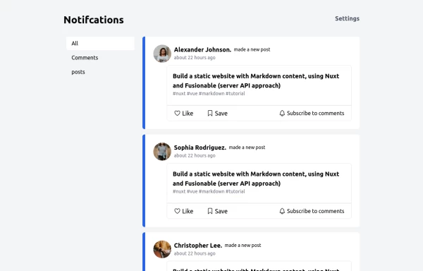 Notification
Dev Community Notification Clone
3.8k -
 SaaS Dashboard Navbar with Search, Notifications & Slide-In Mobile Menu
SaaS dashboard navbar built with pure HTML and Tailwind CSS.
278 -
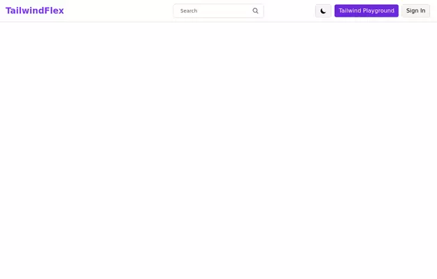 Responsive navbar with dark mode support
Sidebar on small screen devices
20.6k




Browse by topic
Explore components by Tags
Jump straight to the UI pattern you need.
Can't find it?
Didn't find the component you were looking for?
Search across 3,000+ community-built components and grab the code in seconds.