134+ Free Pricing (cards,tables and pages) examples in Tailwind CSS
The pricing section can help to set expectations and establish trust with potential customers by providing clear and transparent information about pricing.
A well-designed pricing section can also help to differentiate the company's products or services from competitors and encourage customers to make a purchase. Additionally, the pricing section can be used to upsell customers by highlighting the features and benefits of more expensive plans or packages.
Here is a collection of elegantly designed pricing cards, pricing tables, pricing lists, pricing charts, and pricing pages.
Similar terms: Service rates, Subscription plans
-
 Subscription Plan Cards
compare and choose between different subscription plans. It provides essential information such as plan name, price, features, and a signup button
1.5k -
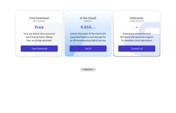 Interactive Pricing Table
This modern pricing component features a visually appealing, responsive layout with smooth hover effects, making it ideal for showcasing different plans and subscription tiers. Design and Features: ✅ Elegant Gradient Backgrounds • Each pricing card has a unique gradient overlay, transitioning from soft gray, blue, or indigo to white, enhancing contrast and visual appeal. • The rounded-2xl design ensures a polished and smooth aesthetic. ✅ Interactive Hover Effects • Cards have a subtle hover shadow enhancement, making them pop on interaction (hover:shadow-[0_0px_25px_0px_rgba(0,0,0,0.2)]). • Slight floating effect (hover:translate-y-[-5px]) gives the illusion of elevation on hover. ✅ Pricing & Plan Details • Each card presents a plan title, a short subtitle, and a bold price display (text-3xl font-extrabold text-indigo-500). • Supports free, subscription-based, and enterprise-tier pricing, ensuring flexibility for different business models. ✅ Call-to-Action Buttons • Each plan features a highly visible CTA button (bg-indigo-700 text-white rounded-md). • The buttons change color on hover (hover:bg-indigo-500) and expand slightly, encouraging user interaction. ✅ Animated Background Icons • A large, transparent icon (text-[500px] text-gray-100) dynamically moves on hover (group-hover:-translate-y-8 group-hover:-translate-x-8), adding depth and a premium feel. This pricing component is perfect for SaaS platforms, digital subscriptions, and service offerings, ensuring a modern, sleek, and engaging user experience. 🚀
2.1k -
 Modern E-commerce Product Card with TailwindCSS
This product card is designed for e-commerce platforms using TailwindCSS. It features a discount badge, product image carousel, quick view and quick order buttons, ratings, product name, brand details, dynamic pricing with a strike-through original price, and a prominent add-to-cart button. The clean and professional layout is perfect for showcasing products on online stores.
2.8k -
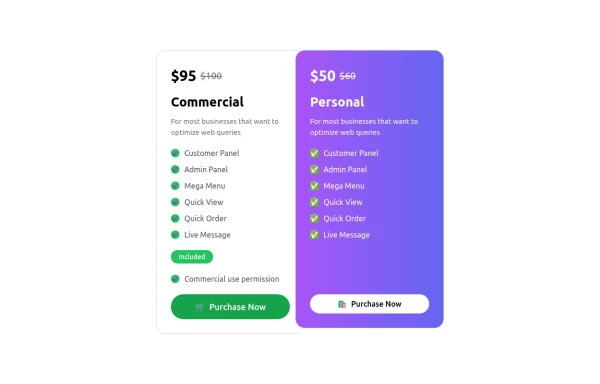 Pricing Table
A modern, responsive Pricing Card Component built with Tailwind CSS. Features dynamic pricing, a feature checklist, and a sleek call-to-action button. Perfect for SaaS, e-commerce, and subscription-based websites. Easily customizable and lightweight.
1.9k -
 Subscription
 list
1.7k -
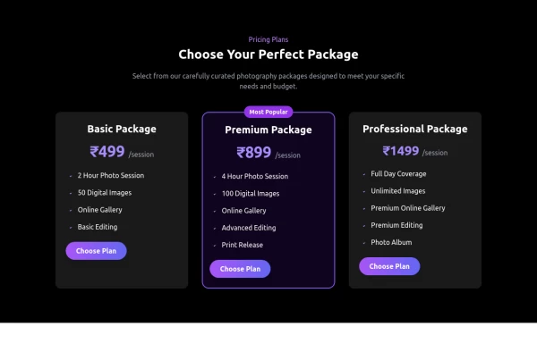 Pricing Card
A responsive pricing card build using html and tailwind css
1.5k -
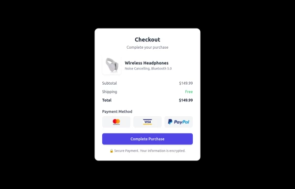 Checkout Card
A modern and responsive checkout card built with HTML & Tailwind CSS, featuring a clean UI, smooth shadows, and interactive hover effects. It includes secure payment options, a clear pricing breakdown, and adapts seamlessly to all screen sizes. Perfect for e-commerce and digital platforms to enhance user experience.
1.9k -

-
 Website Pricing List Card Component
 with Package Names: Basic Package → Starter Website Premium Package → Business Website Professional Package → E-Commerce Solution Pricing Structure: Increased prices significantly to reflect web development services one-time payment model FAQ Content.
1.7k -
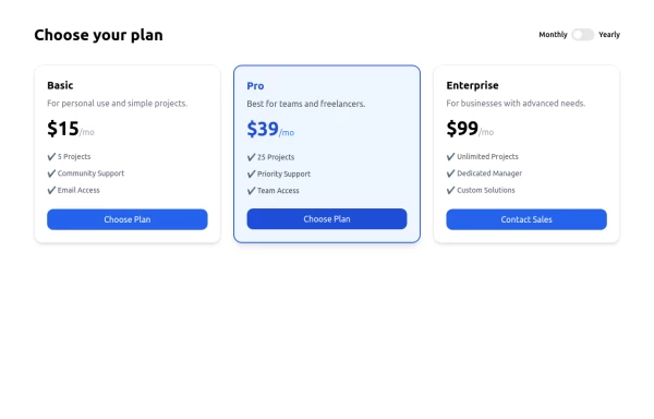 Responsive Pricing Table with Toggle Switch — Built with Tailwind Flex
A clean, responsive Pricing Table UI built entirely with Tailwind CSS and Flexbox. Includes a smooth monthly/yearly toggle switch, fully mobile-friendly layout, and modern design — perfect for SaaS, startups, freelancers, or any web project. 📱 100% Responsive 🎯 Easily customizable 💡 Ideal for client or personal projects
-
 1.7k
-
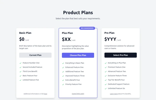 Responsive Multi-Tier Pricing Table Component
flexible and responsive 3-tier pricing table component built with HTML and Tailwind CSS. Features distinct visual styles for different plans (e.g., highlighting a recommended option), adapts to various screen sizes, and supports both light and dark color schemes. Uses generic placeholders for easy adaptation to any product or service.
2k -
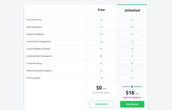 Comparison Pricing Table Component
A responsive pricing table built with HTML and Tailwind CSS, comparing two plans (Free and Unlimited) with a clear feature checklist. Includes distinct styling for the premium plan and a toggle for monthly/annual pricing display.
2.1k -
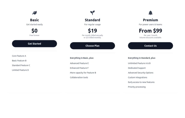 Responsive 3-Tier Pricing Card Section
A clean and responsive pricing table component featuring three distinct tiers (e.g., Basic, Standard, Premium) presented in a card layout. Built with HTML and Tailwind CSS, it stacks vertically on small screens and transitions to a side-by-side view on medium screens (md breakpoint - 768px) and up. Each plan card includes a placeholder icon, title, description, price details, a call-to-action button, and a bulleted list of features with checkmarks. The generic content makes it easy to adapt for various websites or applications needing a clear pricing comparison structure.
982 -
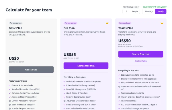 Configurable 3-Tier Responsive Pricing Table
A modern, responsive pricing table component inspired by SaaS layouts, built with HTML and Tailwind CSS. Features three distinct pricing tiers displayed in cards, stacking vertically on smaller screens and transitioning to a 3-column grid on large screens (lg breakpoint). Includes interactive top controls for selecting the number of users and toggling between monthly/yearly billing cycles. Each card uses placeholder content for icons, titles, descriptions, features (with checkmarks/info icons), and distinct call-to-action buttons, making it easily adaptable. Styled with subtle background colors and clear typography for excellent readability.
1.6k







Can't find it?
Didn't find the component you were looking for?
Search across 3,000+ community-built components and grab the code in seconds.