Card with link
This example can be used to show a CTA as a link instead of a button inside the card.
This tailwind example is contributed by Md. Tofayel islam, on 15-Mar-2024. Component is made with Tailwind CSS v3. It is responsive. It supports dark mode.

Author Md. Tofayel islam
Related Examples
-
 medical care
It will help us get medical care quickly using a card and make it possible for all of us, Rwandans and other people in other countries, to have a better life.
9 months ago597 -
 3 years ago32.1k
 -
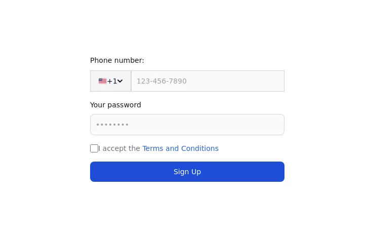 Authentication form
Use this example to authenticate users with a login form using a phone number instead of an email address.
1 year ago3.2k -
 1 year ago1.8k
 -
 3 years ago20.1k
 -
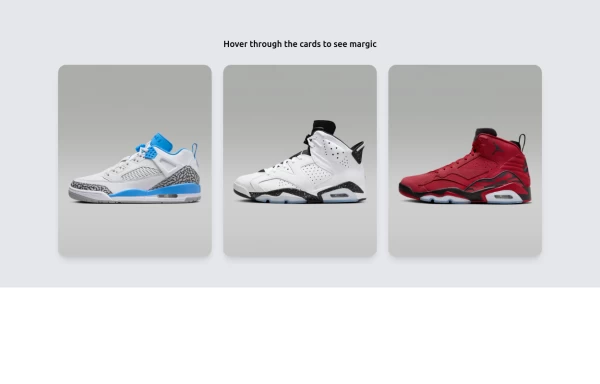
Group hover card
article card
3 years ago11.7k -
 Card
CardProfile Card
10 months ago1.2k -
 1 month ago73
 -
 Tailwind Card Components
A collection of 20+ copy-paste ready card components built with pure HTML and Tailwind CSS. Includes product cards, profile cards, article cards, pricing cards, testimonials, and notifications.
5 months ago581 -
 1 month ago144
 -
 cards
cardscards with background animation
1 year ago3.2k -
 Amazing E-commerce card
An amazing e-commerce card with stunning hover effect
1 year ago2.6k


Explore components by Tags
Didn't find component you were looking for?
Search from 3000+ components