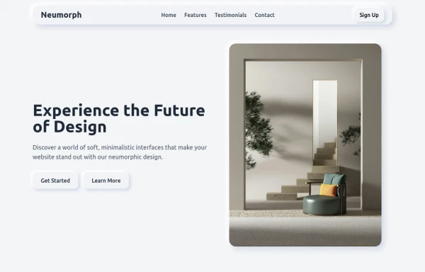
Small landing
This tailwind example is contributed by Crimson, on 14-Jan-2025. Component is made with Tailwind CSS v3. It is responsive. similar terms for this example is Front page

Author Crimson
Related Examples
-
 EduConnect
EduConnect
7 months ago525 -
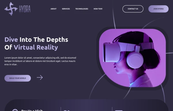
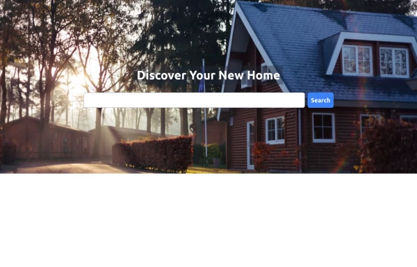 Hero Section
Home hero section search bar
1 year ago7.8k -
 8 months ago748
 -
 Coming Soon Countdown Section – Animated & Responsive
A beautifully designed "Coming Soon" landing section built with Tailwind CSS and Alpine.js, perfect for startups, SaaS platforms, and product launches. This component features a live countdown timer, smooth fade-in animations, and floating gradient effects for a futuristic, engaging look. The layout adapts seamlessly to all screen sizes and supports dark mode, creating a professional pre-launch experience that builds anticipation and excitement. ✨ Key Features ⏳ Dynamic countdown timer (days, hours, minutes, seconds) 🎨 Animated gradient orbs for a vibrant background effect 🌙 Dark mode support included 💨 Smooth entrance animations using Alpine.js 📱 Fully responsive design for all devices 🔗 Social media icons to keep your audience connected 💡 Perfect for: Coming Soon or Under Construction pages Product and SaaS pre-launch sites Portfolio or agency landing pages Event or app launch countdowns
3 months ago209 -
 5 months ago741
 -
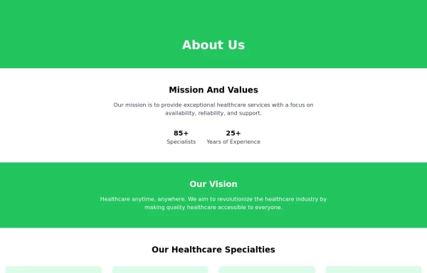 About Us
This The About Us Component with the tailwind class and some animation by tailwind and best about us page you can modify it and content is for now only clinic but you can ad your content
1 year ago5k -
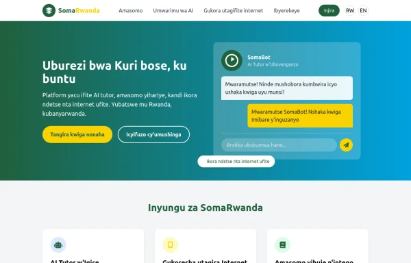 SomaRwanda
Menya uburyo bwo kwandika ibisomwa, impuzandimi, n'imyandikire y'icyongereza mu buryo bworoshye.
9 months ago1.1k -
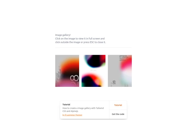 gallary
html , css
10 months ago844 -
 home
homehtml , css
10 months ago1.9k -
 PIXEL.DEV | Portfolio
Personal portofolio
22 hours ago7 -
 neo brutalism page
neo brutalism
1 year ago2k -
 Scholar School - Intelligent Generation with Character
Landing page academic website
21 hours ago4


Explore components by Tags
Didn't find component you were looking for?
Search from 3000+ components