Card
Jobs recommended for you LinkedIn Clone
This tailwind example is contributed by $@(\/)(\/)¥, on 10-Apr-2025. Component is made with Tailwind CSS v3. It is responsive. It supports dark mode.

Author $@(\/)(\/)¥
Related Examples
-
 1 year ago1.8k
 -
 1 year ago2k
 -
 2 years ago2.3k
 -
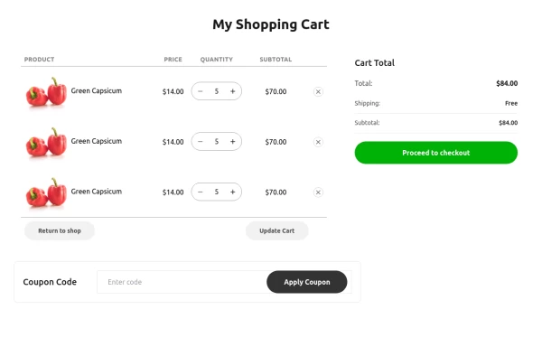
 Service/Product card
Tour trip booking showcase card
3 years ago13.2k -
 card2
card2card2
8 months ago494 -
 1 year ago1.8k
 -
 Card kpi Chart
Targetas kpi con graficas
4 months ago744 -
 3 years ago15.8k
 -
 10 months ago804
 -
 3 years ago16.7k
 -
 Carousel Card Slider Swiper on Alpine.JS
with support drag and drop mouse actions
1 year ago13.4k -
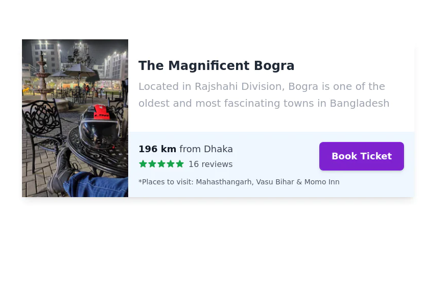
 Clickable and Responsive Card Grid
It is designed to showcase and link to various topics or content categories.
2 years ago11.3k


Explore components by Tags
Didn't find component you were looking for?
Search from 3000+ components