Input output form
This tailwind example is contributed by Prajwal Hallale, on 08-Dec-2022. Component is made with Tailwind CSS v3. It is responsive.

Author Prajwal Hallale
Related Examples
-
 4 months ago210
 -
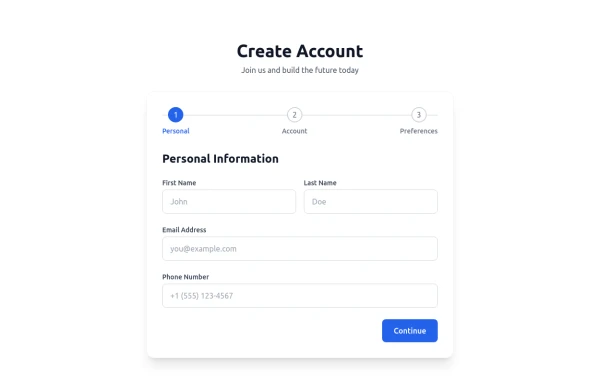 Multi-Step Form with Progress Tracker
sleek and interactive multi-step registration form built with Tailwind CSS and Alpine.js, perfect for onboarding users through a smooth, step-by-step experience. This component enhances user engagement with animated transitions, real-time validation, and a dynamic progress bar that visually tracks completion. It’s fully responsive, dark-mode ready, and ideal for modern SaaS applications, startup landing pages, or authentication systems. ✨ Key Features 🪜 Three-step flow: Personal Info → Account Setup → Preferences ⚡ Real-time field validation with instant feedback 🔒 Password visibility toggles for better UX 📈 Progress bar tracker with smooth animations ✅ Success confirmation with user details preview 🌙 Dark mode support for modern UI design 💨 Alpine.js-powered interactivity – no external JS frameworks needed 📱 Fully responsive design optimized for all devices 💡 Perfect for: SaaS or startup registration flows Onboarding or sign-up pages Form builders, dashboard templates, or web app UIs UI component libraries & code snippets collections
4 months ago622 -
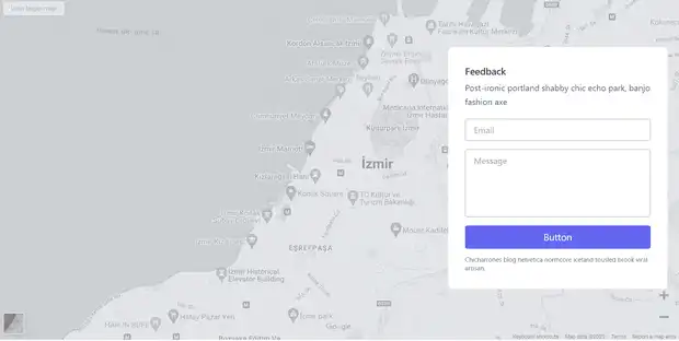 Feedback Form
Feedback Form with a map
2 years ago8.6k -
 login
loginDark mode login
10 months ago1.4k -
 11 months ago787
 -
 Registration Form
Color Updates: - Changed gradient background to `from-indigo-800 to-blue-900` - Updated text colors to `text-indigo-800` and `text-indigo-900` - Changed button colors to match the new theme - Updated focus rings to use indigo colors Enhanced Styling: - Added smooth transitions with `transition-all duration-300` - Improved shadow with `shadow-2xl` - Added hover scale effect on button - Increased border radius to `rounded-xl` - Added fade-in animation for the form Improved Validation: - Added visual feedback for invalid fields - Added input event listeners to clear error states - Added trim() to username and email validation - Added form reset after successful submission Accessibility Improvements: - Maintained proper contrast ratios - Kept focus states visible - Added proper spacing for better readability - Ensured all interactive elements are properly styled Added Interactions: - Smooth hover transitions - Scale animation on button hover - Immediate feedback on input - Clear error messaging
1 year ago3k -
 Contact Form for fabform.io
Contact form that uses fabform.io
1 year ago949 -
 3 years ago10.3k
 -
 Contact us form
Contact us form
2 years ago6.4k -
 1 year ago1.6k
 -
 11 months ago1.1k
 -
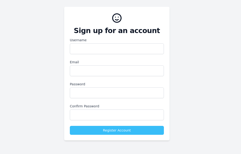 Sign up form
simple full-height register form
3 years ago13.1k


Explore components by Tags
Didn't find component you were looking for?
Search from 3000+ components