OmerLinkSound
OmerLinkSound
This tailwind example is contributed by Omer fils ELENGA, on 04-Jan-2026. Component is made with Tailwind CSS v3. It is responsive. similar terms for this example is Front page

Author Omer fils ELENGA
Related Examples
-
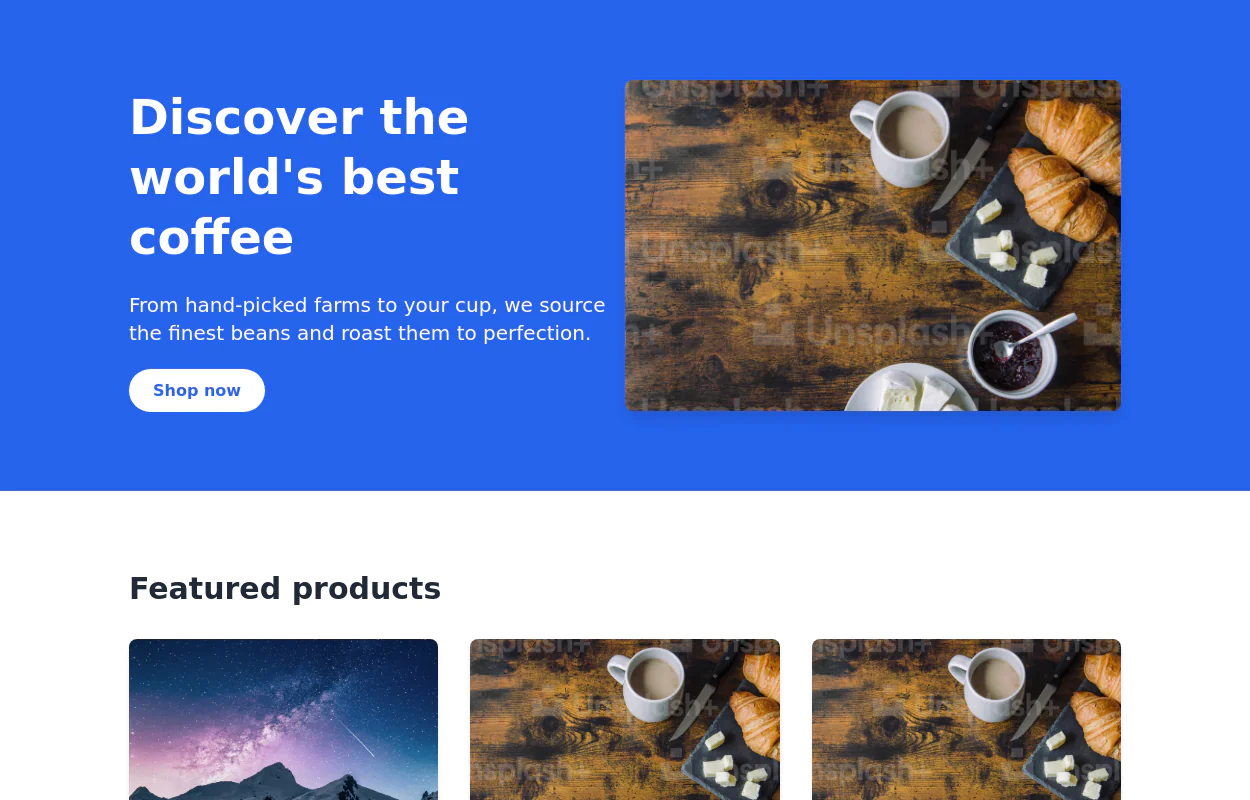 3 years ago13.4k
 -
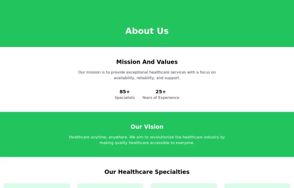 About Us
This The About Us Component with the tailwind class and some animation by tailwind and best about us page you can modify it and content is for now only clinic but you can ad your content
1 year ago4.9k -
 ChinaEdu
ChinaEdu
7 months ago418 -
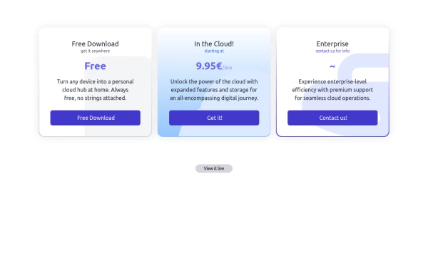 Interactive Pricing Table
This modern pricing component features a visually appealing, responsive layout with smooth hover effects, making it ideal for showcasing different plans and subscription tiers. Design and Features: ✅ Elegant Gradient Backgrounds • Each pricing card has a unique gradient overlay, transitioning from soft gray, blue, or indigo to white, enhancing contrast and visual appeal. • The rounded-2xl design ensures a polished and smooth aesthetic. ✅ Interactive Hover Effects • Cards have a subtle hover shadow enhancement, making them pop on interaction (hover:shadow-[0_0px_25px_0px_rgba(0,0,0,0.2)]). • Slight floating effect (hover:translate-y-[-5px]) gives the illusion of elevation on hover. ✅ Pricing & Plan Details • Each card presents a plan title, a short subtitle, and a bold price display (text-3xl font-extrabold text-indigo-500). • Supports free, subscription-based, and enterprise-tier pricing, ensuring flexibility for different business models. ✅ Call-to-Action Buttons • Each plan features a highly visible CTA button (bg-indigo-700 text-white rounded-md). • The buttons change color on hover (hover:bg-indigo-500) and expand slightly, encouraging user interaction. ✅ Animated Background Icons • A large, transparent icon (text-[500px] text-gray-100) dynamically moves on hover (group-hover:-translate-y-8 group-hover:-translate-x-8), adding depth and a premium feel. This pricing component is perfect for SaaS platforms, digital subscriptions, and service offerings, ensuring a modern, sleek, and engaging user experience. 🚀
1 year ago1.7k -
 tinderclone By omerlinks
tinderclone By omerlinks
2 months ago69 -
 High-Performance Hotel Operations & AI Agent Testing Dashboard
A sophisticated, real-time command center designed for modern hotel management. This dashboard features deep integration for monitoring AI agent performance, guest sentiment, and room occupancy. Built with a "Mobile-First" philosophy, it demonstrates advanced data visualization, glassmorphism UI design, and a centralized state-management architecture. Perfect for showcasing full-stack capabilities in AI-driven automation.
1 week ago108 -
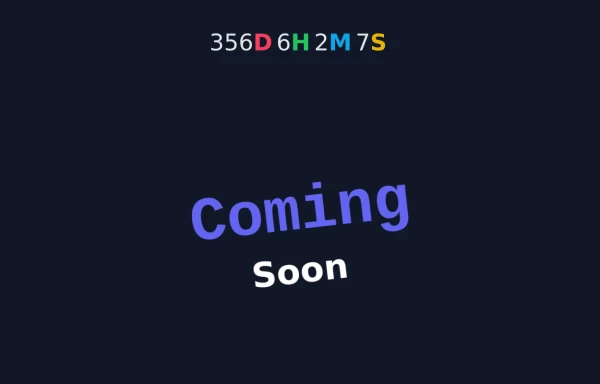 Animated Coming Soon Page 2
Animated Coming soon Page
1 year ago3.7k -
 ChaiCode
ChaiCode
7 months ago1.2k -
 Premium High-Performance Web Gaming Hub
Experience the future of browser-based gaming. I’ve developed a premium arcade hub designed for speed, clarity, and zero-latency gameplay. Built with modern web technologies, Ayyamperumal Games brings AAA-inspired visuals and high-octane mechanics directly to your browser—no downloads, no lag, just pure performance. Explore a curated library of titles ranging from minimalist logic puzzles like Sudoku Elite to fast-paced action in Neon Drift. This is where clean code meets high-level entertainment.
2 months ago283 -
 Complete Profile Form with Avatar Upload & Social Links
A fully responsive profile setup form built with Tailwind CSS and Alpine.js. Users can upload a profile picture, fill in personal and professional details, add social links, and receive real-time validation feedback. Includes a smooth success message animation after submission, with optional navigation to the profile or dashboard. Perfect for onboarding flows or user account management interfaces.
4 months ago271 -
 about video
about kelaplus video
7 months ago830 -
 Animated Coming Soon Page 1
animated coming soon landing page
11 months ago844


Explore components by Tags
Didn't find component you were looking for?
Search from 3000+ components