Fullscreen login form with image backround
This tailwind example is contributed by Rithik, on 29-Feb-2024. Component is made with Tailwind CSS v3. It is responsive. similar terms for this example are Register, Sign in

Author Rithik
Related Examples
-
 LinkedIn sign-up form
A clone of LinkedIn sign-up page
1 year ago2k -
 3D login form and responsive designe
Made a resposnvie form and 3d animation
1 month ago48 -
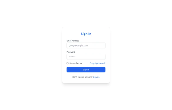 Sign In Form
Clean and modern Sign In form with email, password, and "Forgot password" link. Fully responsive and styled with Tailwind CSS, perfect for SaaS platforms.
8 months ago797 -
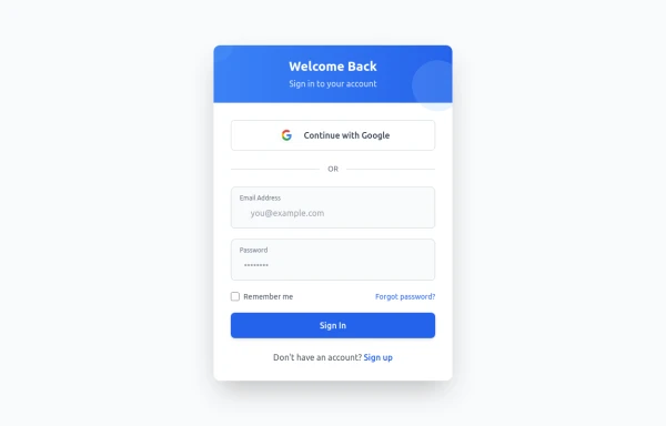
 Elegant Login Form Design for Your Platform
A professionally designed and responsive login form built with TailwindCSS. Featuring a sleek layout with a gradient button, modern input fields, and user-friendly interactions, it’s perfect for any e-commerce, SaaS, or online platform. Includes options for "Forgot Password" and "Remember Me" functionality, providing a seamless user experience.
1 year ago1.5k -
 login!!!!
html , css
9 months ago1.2k -
 login page
login page
2 months ago229 -
 11 months ago1.2k
 -
 4 months ago437
 -
 3 months ago236
 -
 Login
LoginLogin Creen office
1 year ago1.2k -
 Loginform
Animated Login Form with Google Sign-In (Tailwind CSS)
9 months ago817 -
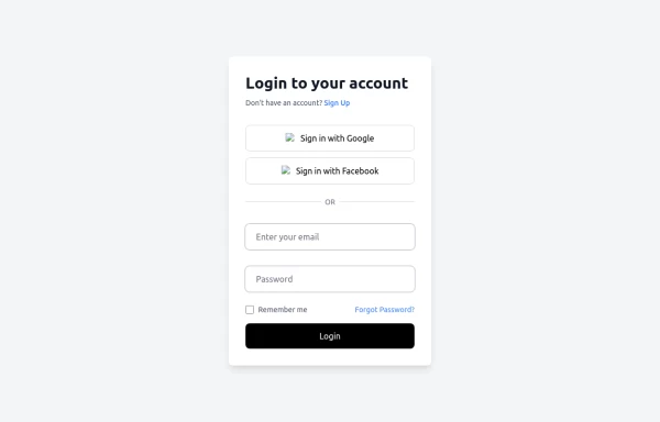 Modern and Fully Responsive Login Form with Social Media Authentication and Floating Label Inputs
This sleek, fully responsive login form is designed with usability and aesthetics in mind. It features a clean, minimalistic design with smooth transitions and modern UI elements. The form includes: Email and Password Inputs: Both fields feature floating labels that animate seamlessly when focused or filled, ensuring a visually appealing user experience. Input validation is built-in, and placeholders are hidden for a clean look. Social Media Login Buttons: Integrated Google and Facebook sign-in buttons, allowing users to authenticate easily using their social media accounts. These buttons are styled to match the platform’s branding and include an intuitive hover effect to enhance interactivity. “Forgot Password?” & “Remember Me” Options: The form allows users to easily reset their password or opt to remain logged in. These options are aligned neatly, and the labels are clear and concise for accessibility. Custom Styling: Built with Tailwind CSS, ensuring a responsive, mobile-first design that adapts seamlessly to any screen size. The form's design utilizes smooth hover effects, rounded corners, subtle shadow effects, and modern color schemes for an enhanced visual appeal. Easy Integration: This component can be easily integrated into any web application. Whether you're building a dashboard, a website, or a SaaS product, this login form is a perfect fit for any modern application that needs secure user authentication. Features: Fully responsive: Looks great on mobile, tablet, and desktop. Floating labels: Clear input fields with animated labels that enhance the user interface. Social Media Integration: Includes Google and Facebook login options for quick authentication. Password Reset: A "Forgot Password?" link allows for easy password recovery. Remember Me: A checkbox for staying logged in. Customizable Design: Built using Tailwind CSS, easy to adapt to match any branding. Smooth Interactivity: Subtle hover effects and animations for a modern user experience. This login form not only provides the essential features needed for user authentication but also elevates the user experience with its modern design and smooth animations.
1 year ago1.2k


Explore components by Tags
Didn't find component you were looking for?
Search from 3000+ components