Summer Collection 2025
Summer Collection 2025
This tailwind example is contributed by matoleo chance, on 27-May-2025. Component is made with Tailwind v3.4. It is responsive.

Related Examples
-
 Responsive Header and Hero Section Design
Responsive Header and Hero Section Design provides flexible adaptability across all screen sizes and devices.
3.7k -
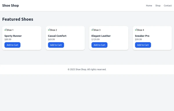 SHOES SHOP
all categories of shoes like women ,men ,and children
1.1k -
 LIQUID PLASMA by omerlinks
LIQUID PLASMA by omerlinks
649 -

-

-
 Responsive Hero Section
Get this professional hero section for your website. Includes a gradient text effect, stylish background blurs, and a perfectly aligned image section. Easy to integrate and fully customizable for any project.
737 -
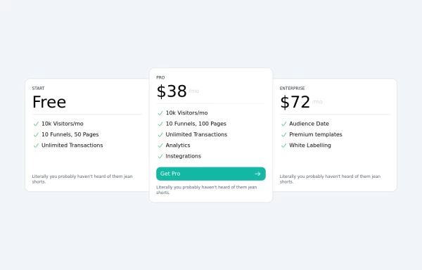 Tailwind Pricing Section 2
Fully Responsive Pricing Section
2.8k -
 MENU OMERLINKS
MENU OMERLINKS
726 -
 Responsive Hero Section with Typewriter Effect
A modern hero section featuring a typewriter animation effect, social media links, and responsive design. Includes a user avatar placeholder and a clean dark gradient background. Built with Tailwind CSS and Font Awesome icons. Perfect for personal portfolio websites.
-
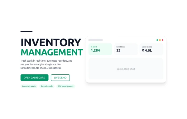 Inventory
management
895 -
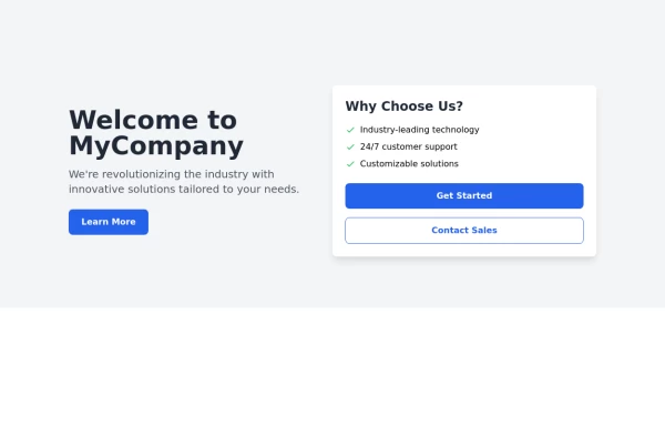 Responsive Hero Section
Key features of this hero section: 1. Responsive layout: Uses a column layout on mobile and switches to a row layout on medium screens and larger. 2. Left side: - Company name as a large heading - Brief description - "Learn More" button 3. Right side: - "Why Choose Us?" section with bullet points - Two call-to-action buttons: "Get Started" and "Contact Sales" 4. Styling: - Uses Tailwind's utility classes for responsive design, colors, spacing, and typography - Incorporates a shadow and rounded corners for the right-side content box - Includes hover effects on buttons for better interactivity This hero section will be fully responsive: - On mobile devices, it will stack vertically with the company info on top and the details below. - On larger screens, it will display in a two-column layout. The use of Tailwind CSS classes ensures that the design is consistent and easily adjustable. You can further customize the colors, fonts, and spacing to match your brand's specific design guidelines. Would you like me to explain any part of this code or make any adjustments?
-









Browse by topic
Explore components by Tags
Jump straight to the UI pattern you need.
Can't find it?
Didn't find the component you were looking for?
Search across 3,000+ community-built components and grab the code in seconds.