Pricing card
This tailwind example is contributed by Laurits, on 04-Nov-2022. Component is made with Tailwind v3.4. It is responsive. It supports dark mode. similar terms for this example are Service rates, Subscription plans

Related Examples
-
 15.4k
-
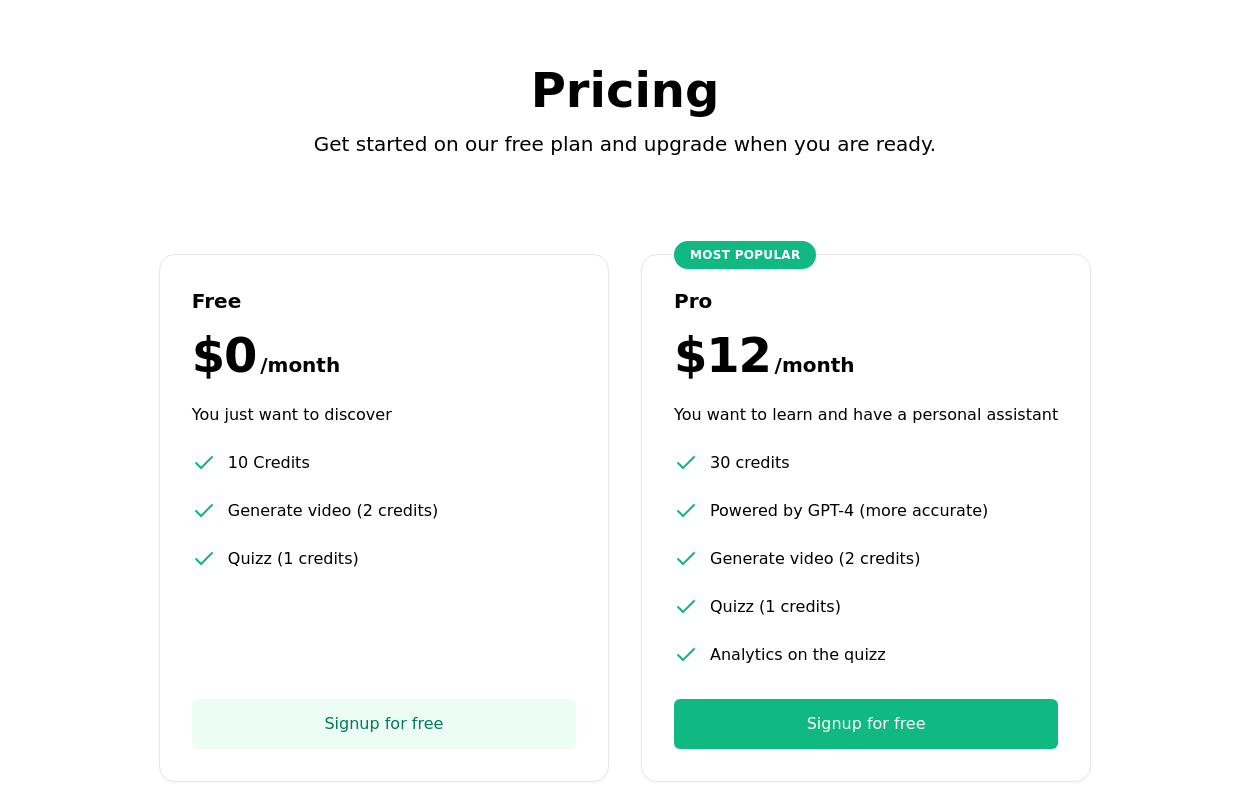 Subscription Plan Cards
compare and choose between different subscription plans. It provides essential information such as plan name, price, features, and a signup button
12.6k -

-
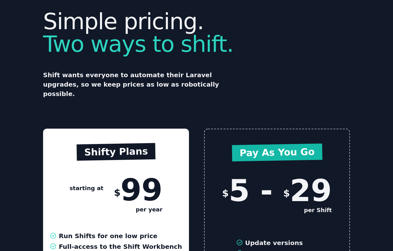 Pricing table
pricing table for a software or service offering
11.8k -
 10.8k
-

-
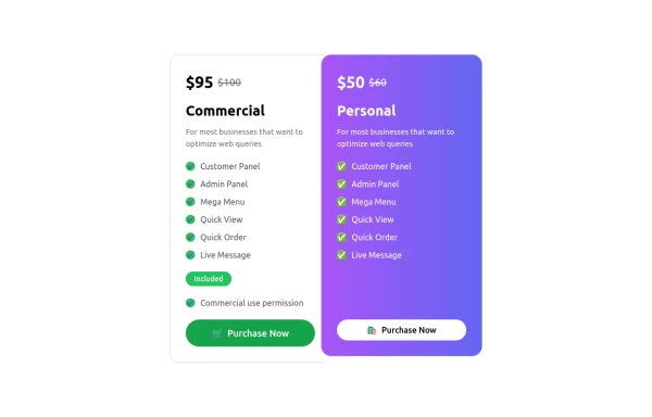 Pricing Table
A modern, responsive Pricing Card Component built with Tailwind CSS. Features dynamic pricing, a feature checklist, and a sleek call-to-action button. Perfect for SaaS, e-commerce, and subscription-based websites. Easily customizable and lightweight.
1.9k -

-
 Tiered Pricing Blocks
An organized way to compare different product offerings or pricing tiers. Users can quickly assess the features and pricing for various products.
10.2k -
 Pricing cards - with features list
Flexible Pricing Plans Cards
4.9k -
 Card
Card
3k -
 Swiss-Grid Dark Pricing
A brutally minimalist pricing section that relies on strict grid architecture and typographic hierarchy instead of decorative elements. Features responsive border collapsing, monospaced technical accents, and high-performance CSS-only hover states. Designed for high-end SaaS, dev-tools, or agency portfolios that prioritize data clarity and structural rhythm.
827








Browse by topic
Explore components by Tags
Jump straight to the UI pattern you need.
Can't find it?
Didn't find the component you were looking for?
Search across 3,000+ community-built components and grab the code in seconds.