Product rating section
display star rating stats with user avatars
This tailwind example is contributed by Erik Hyatt, on 09-Jun-2023. Component is made with Tailwind v3.4. It is responsive. similar terms for this example is Vote

Related Examples
-
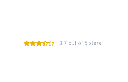 Star rating svg buttons
buttons consist of star,star-filled, and star half-filled
11.4k -
 14.5k
14.5k -
 15.6k
15.6k -

-
 13.2k
13.2k -
 10k
10k -
 The Free AI Tools Grid Section (210+ Tools, No Signup)
A responsive and SEO-optimized grid section showcasing over 210 free AI tools. Designed with Tailwind CSS, fully responsive, fast-loading, and built for high user engagement. No sign-up required, privacy-friendly, and optimized for performance and discoverability.https://www.thefreeaitools.com/
619 -
 The Free AI Tools Grid Section (210+ Tools, No Signup)
A responsive and SEO-optimized grid section showcasing over 210 free AI tools. Designed with Tailwind CSS, fully responsive, fast-loading, and built for high user engagement. No sign-up required, privacy-friendly, and optimized for performance and discoverability.https://www.thefreeaitools.com/
-
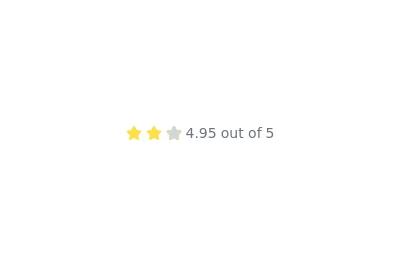 Rating with text
you also want to show a text near the stars you can use this example as a reference. @zobaidulkazi
2.2k -
 CTA block
with user avatars and 2 buttons
3.2k -
 Avatar
This Avatar component includes: 1. Responsive design using Tailwind CSS classes 2. Indigo-800 and Blue-900 color scheme 3. Dark mode support 4. User avatar with hover effect and online status indicator 5. User name and role 6. Follow button with hover effect 7. Follower count 8. Subtle animations and transitions 9. Accessibility considerations (proper contrast, focus states) Key features: - The background uses a gradient from Indigo-800 to Blue-900 - The avatar card has a white background in light mode and dark gray in dark mode - Text colors are adjusted for readability in both light and dark modes - The avatar image has a border color that changes in dark mode - The avatar has a scale effect on hover and a ring appears around it - The Follow button uses Indigo-800 with a Blue-900 hover state - The card has a shadow effect that changes color on hover - Dark mode is automatically applied based on system preferences - The entire card has a subtle transition effect for smooth color changes - Proper focus states are implemented for the button This design provides a clean, interactive avatar component while incorporating the requested color scheme and maintaining good usability across different devices and color modes.
3k -







Browse by topic
Explore components by Tags
Jump straight to the UI pattern you need.
Can't find it?
Didn't find the component you were looking for?
Search across 3,000+ community-built components and grab the code in seconds.