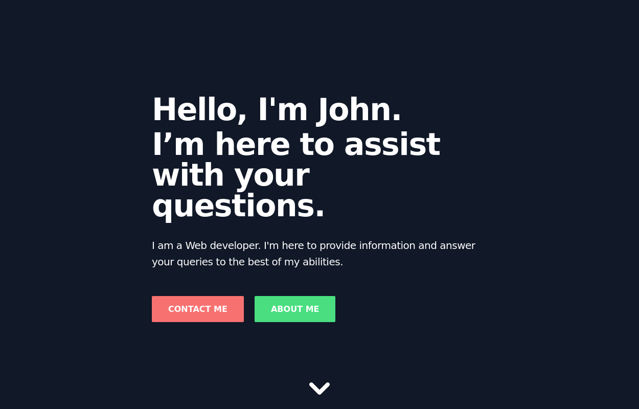
Responsive Header and Hero Section Design
Responsive Header and Hero Section Design provides flexible adaptability across all screen sizes and devices.
This tailwind example is contributed by ABDO-SY, on 20-Feb-2025. Component is made with Tailwind CSS v3. It is responsive.

Author ABDO-SY
Related Examples
-
 Hero section
Hero section for your project
3 years ago9.1k -
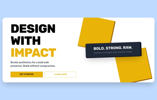
 Full-page header for landing pages
an attention-grabbing header with a strong message and clear calls to action.
2 years ago11.8k -
 2 years ago7.1k
 -
 Hero Section
Home hero section search bar
1 year ago7.8k -
 Stars: Sun and Moon Illustrations
I Created Sun and Moon Illustrations with Tailwind CSS, Embracing Light and Dark Modes
1 year ago4.3k -
 1 year ago6k
 -
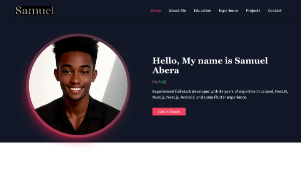 Portfolio Hero Section 1
visually stunning and captivating hero section component for your portfolio website.
1 year ago5.7k -
 Portfolio Hero Section 3
visually stunning and captivating hero section component for your portfolio website.
1 year ago8.6k -
 Tailwind Hero Section
Fully Responsive Hero Section with Navbar
1 year ago5k -
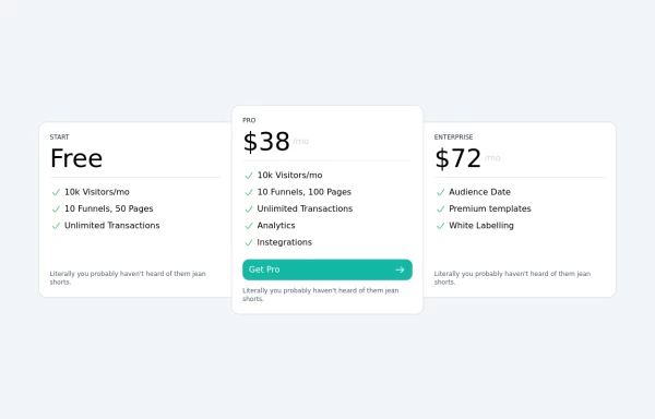
 Tailwind Pricing Section
Fully Responsive Pricing Section
1 year ago1.8k -
 Tailwind Pricing Section 2
Fully Responsive Pricing Section
1 year ago2.3k -
 1 year ago2.7k


Explore components by Tags
Didn't find component you were looking for?
Search from 3000+ components