53+ Free Sidebar examples in Tailwind CSS
Similar terms: drawer
-
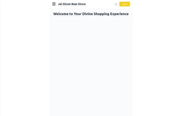 Responsive eCommerce Sidebar Layout with Hamburger Menu | Tailwind CSS UI for Online Stores
Build a clean and responsive eCommerce sidebar layout with a smooth hamburger menu using Tailwind CSS and Alpine.js. Ideal for devotional, spiritual, or modern online stores. Includes dark mode support, navigation links, cart, login, and a dynamic layout for beautiful product pages.
1.5k -
![Material 3 Drawer [Light]](https://tailwindflex.com/storage/thumbnails/material-3-drawer-light/canvas.min.webp?v=7) Material 3 Drawer [Light]
Material 3 Drawer [Light]A sidebar drawer that conforms to Google's Material 3 design guidelines
1.1k -
![Material 3 Drawer (Responsive) [Light]](https://tailwindflex.com/storage/thumbnails/material-3-drawer-responsive-light/canvas.min.webp?v=5) Material 3 Drawer (Responsive) [Light]
Material 3 Drawer (Responsive) [Light]A sidebar drawer that conforms to Google's Material 3 design guidelines. Static sidebar when the screen is >=lg. Collapses into a drawer when the screen is <lg.
1.6k -
-

-
 1.5k
1.5k -

-
 1.2k
1.2k -
 Sidebar Off canvas
How it Works: Off-Canvas Sidebar Component This component uses HTML5, Tailwind CSS, and Vanilla JavaScript to create a smooth, performant sidebar navigation. The Trigger Mechanism: The Menu Button uses an onclick="toggleSidebar()" event to trigger the opening sequence. We use a semantic <button> tag for accessibility. The UI Structure (HTML & Tailwind): Overlay (#sidebar-overlay): A fixed inset-0 div covers the entire screen with a semi-transparent black background (bg-black/50). It starts hidden and transparent (opacity-0 hidden) to prevent interaction when closed. Sidebar Panel (#sidebar-panel): Positioned with fixed top-0 left-0 h-full, it occupies the full height of the screen. Animation State: We use transform -translate-x-full to hide the panel completely off-screen to the left by default. The transition-transform duration-300 class ensures the sliding movement is smooth. The Logic (JavaScript): The toggleSidebar() function handles the state: Opening: It removes the -translate-x-full class (sliding the panel into view) and removes hidden/opacity-0 from the overlay (fading it in). Closing: It adds the classes back to reverse the animation. Crucially, it uses setTimeout(..., 300) when closing. This delays the hidden class application by 300ms, allowing the CSS fade-out animation to complete fully before the element is removed from the flow. Flexbox Layout: The panel uses flex flex-col to vertically stack the Header, Content, and Footer. The middle section has flex-1 overflow-y-auto, ensuring that if the menu items exceed the screen height, only that area scrolls while the header and footer stay pinned.
-
 sidebar dash
sidebar dash
951 -
 sidebar responsive
responsive sidebar with working links
1.2k -
 sdebar simple
sdebar simple
412 -
 Reader AI – Your AI-Powered Knowledge & Thinking System
Reader AI helps you read, think, and remember better. Upload books, highlight insights, chat with AI, and build a personal knowledge system that evolves with you.
455 -
 Sticky Navbar
A modern, feature-rich, and fully responsive navigation bar built with Tailwind CSS. This premium navbar includes a top contact bar, multi-level mega menus, live search with suggestions, mobile drawer navigation, nested accordion menus, authentication buttons, sticky header, and smooth interactions. Perfect for SaaS, corporate, startup, agency, eCommerce, legal, education, and business websites.
152 -
 SaaS Dashboard Navbar with Search, Notifications & Slide-In Mobile Menu
SaaS dashboard navbar built with pure HTML and Tailwind CSS.
218


Can't find it?
Didn't find the component you were looking for?
Search across 3,000+ community-built components and grab the code in seconds.