116+ Free Feature showcase examples in Tailwind CSS
Similar terms: Services,Why choose us
-
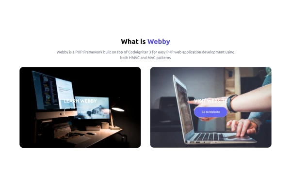 What is Webby
Webby is a PHP Framework built on top of Codeigniter 3 for easy PHP web application development using both HMVC and MVC patterns.
1 year ago2.1k -
-
 beautifull feature section
We create a Advance animated feature section using tailwindcss and custom css
1 year ago2.7k -
 beautifull web page
I create a web page using cloude ai its amazing.
1 year ago3k -
 1 year ago2k
 -
 1 year ago1.8k
 -
 free tailwind personal portfolio template
free tailwind personal portfolio template
1 year ago87 -
 Feature Section
A section that allows you to share features about your product and an example of your product
1 year ago2.4k -
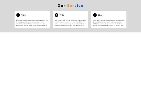
 Services
Card Services Section. find it makecomponents.com
1 year ago2.2k -
 Showcase Your Services with Interactive Animations: A Modern HTML and Tailwind CSS Example
Discover how to create an eye-catching services section using plain HTML and Tailwind CSS. This modern example features interactive animations that bring your services to life. With smooth hover effects and responsive design, this section is perfect for enhancing your website's user experience. Easily customize the content to fit your needs, and let Tailwind CSS handle the styling and transitions for a polished, professional look.
1 year ago2.7k -
 1 year ago1.9k
 -
 Facts
FactsA simple facts overview
1 year ago1.7k -
 1 year ago1.1k
 -
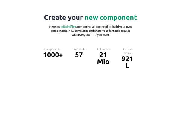
 Facts
FactsLarge fact counters with the "centered" title, a quarter overstand to the right site. Die JS-Line set the titles, so you only have to change the text -- and or modify the counters- or the titles background-color. [VIEW-NOTICE] If you change the from XS over MD to XL ... right-click here into the showcase and click "reload frame" or test it on you own site directly.
1 year ago1.7k -
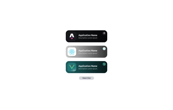 Applications Showcase
This is a stylish and interactive application showcase component designed for web use. It features the following elements: Background Styling: The main container has a rounded-rectangle shape (rounded-3xl) with a subtle white base overlaying a high-resolution background image, styled with background-size: 600px for an artistic touch. The image itself dynamically serves as a backdrop, giving the component a layered appearance. Main Icon: A small circular icon, located at the top-right corner, appears with smooth hover effects: Enlarges to double its size (scale-[2]). Rotates (rotate-[410deg]). Moves diagonally upwards-right (translate-x-3, -translate-y-3). These transitions occur over a duration of 1 second (transition duration-1000). Overlay Gradient: A transparent gradient overlay (bg-gradient-to-l) adds a polished depth effect, transitioning from black (from-black/80) to lighter shades. App Icon and Info: Icon: The app icon is a smaller, bordered square image (rounded-2xl) with hover shrink animations (group-hover:scale-95). Text: A bold application title (text-md font-semibold) with hover-animated underline effects that gradually expand from left to right. A short app description styled as secondary text. Call-to-Action Button: Below the card is a subtle, rounded button (rounded-full) encouraging interaction. It features: A hover effect with color inversion (gray to black). A lift effect (hover:-translate-y-1) when hovered. This component is perfect for modern app showcases, offering a dynamic, user-friendly visual experience. It ensures a professional look while engaging users through smooth animations and clear calls to action.
1 year ago2.6k


Didn't find component you were looking for?
Search from 3000+ components