500+ Free Card examples in Tailwind CSS
A card component is a flexible and extensible content container. Card has wide range of uses.
-
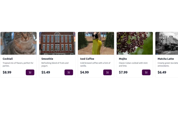 Carousel Card Slider Swiper on Alpine.JS
with support drag and drop mouse actions
14.2k -

-
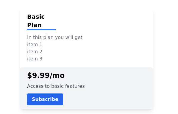 Pricing card
basic pricing card with single price
11.3k -

-
 About Me Card
266 -
 Card profile
profile card
3.4k -
 Card Component
This component is a simple card (without image) component with hover effect & Dark mode Supported & full responsive
4.3k -

-
 Tailwind AoPS Demo
Starter code for an interactive Tailwind Demo
196 -
 Tailwind AoPS Demo II
Starter code for an interactive Tailwind Demo (solo)
203 -
-

-
 User Profile Card
The card features a user's profile picture, name, location, and options for interactions. It has a clean and modern design with rounded edges and icons for user engagement. It also has support for dark mod:
316 -
 Clone of LinkedIn Questionnaire Card
4.1k -
 Why Us section with hover animation
Why to choose us section, responsive and hove animation
5.7k







Can't find it?
Didn't find the component you were looking for?
Search across 3,000+ community-built components and grab the code in seconds.