500+ Free Card examples in Tailwind CSS
A card component is a flexible and extensible content container. Card has wide range of uses.
-

-
 sticky headings
6.6k -
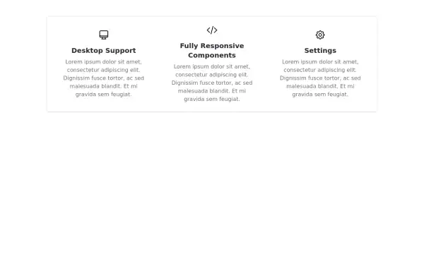 Responsive Features Section
It's a Handy Ready to Use Responsive Features or Services Component with Dark Mode
6.1k -
 12.3k
-

-
 Pricing card
Reveal details on hover
5.3k -
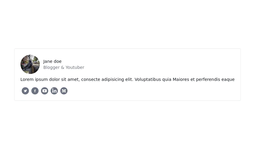
 User Profile Card
Useful for testimonials and reviews section
11.3k -
-
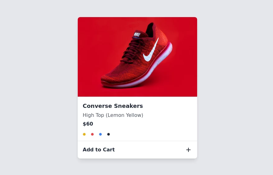 Product card
sleek and modern product card
7.5k -

-
 12.5k
-

-
 Astro build starter template with Tailwind
4.5k -
 13.6k
-
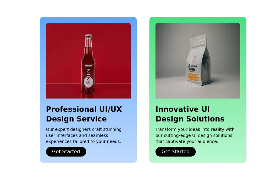
 Info Card with image
An info card with an image, a short title, and a short description.
13.8k




Can't find it?
Didn't find the component you were looking for?
Search across 3,000+ community-built components and grab the code in seconds.