All components
-
-
Canlı Yayın Butonu
Pulse efekt içeren canlı yayın butonu.
2.6k -
 Plug and Play Button - Animated gradient background
Know errors: You may need to remove animate-spin for your usecase, depending on framework rendering. For SvelteKit, animate-spin is NOT needed. But the [animation:spin_4s]... is always necessary for a smooth effect. Check out my profile to join my community online or add me on LinkedIn.
2.7k -
Plug and Play Animated Button for Hero Statements / Landing Pages
REMOVE the bg-black from the outside <button/> div, if you are already using a black background. Besides this, the button is plug and play! Know errors: You may need to remove animate-spin for your usecase, depending on framework rendering. For SvelteKit, animate-spin is NOT needed. But the [animation:spin_4s]... is always necessary for a smooth effect. Check out my profile to join my community online or add me on LinkedIn.
2.6k -
 Sidebar
This is the sidebar that I use in my projects, I use grid to be able to manage the space issue a little better, it seems like a clean and modern design, it is more than anything for the dashboards that you want to create
4.8k -
 Arama Sonuçları Sayfası
Sayfa içerik türüne göre icon ile desteklenen arama formu ve arama sonuçları sayfası
2.5k -
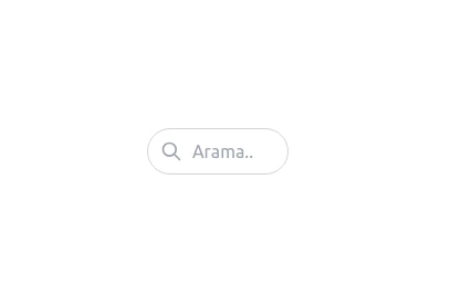 Animasyonlu Arama Textbox Widget
Üzerine gelince animasyonlu olarak açılan textbox.
2.8k -
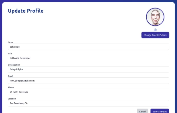 Update Profile
Update profile page with basic informations
3.6k -
 Simple Profile Card.
Profile page with basic informations
3.6k -
 beautiful buttons set
a beautofull buttons set like primary, outline and text.
2.1k -
-
 Sidebar
This HTML file includes: 1. A responsive sidebar with 3D animation effects: 1. The sidebar slides in and out smoothly. 2. Navigation items have a 3D hover effect using CSS transforms and transitions. 2. Tailwind CSS for styling: 1. Included via CDN for easy setup. 2. Used for layout, colors, and basic styling. 3. Custom CSS for animations and 3D effects: 1. Keyframe animations for sidebar open/close. 2. 3D transform effects for nav items. 4. JavaScript for interactivity: 1. Toggles the sidebar open and close. 2. Adds 3D effect to nav items on hover using mouse position. 3. Closes the sidebar when clicking outside. 5. Accessibility features: 1. ARIA label for the toggle button. 2. Keyboard navigation support (Enter/Space to toggle sidebar). 3. Focus trapping within the sidebar when open. 6. Responsive design: 1. The sidebar is full-height and toggleable, suitable for both desktop and mobile views. This implementation provides a visually appealing sidebar with 3D animations and effects, while maintaining accessibility and responsiveness. It uses HTML for structure, Tailwind CSS for styling, and vanilla JavaScript for interactivity, as requested.
2.9k -
 Portfolio
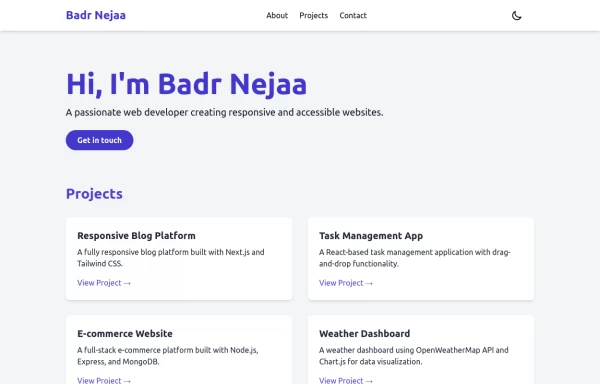
This responsive portfolio with dark mode support includes: 1. Fully responsive design that works on both desktop and mobile devices 2. Dark mode toggle with system preference detection and local storage persistence 3. Indigo-800 and Blue-900 color scheme for primary colors in light and dark modes 4. Beautiful animations and effects: 1. Fade-in and slide-up animations for sections using Intersection Observer 2. Hover effects on projects and buttons 3. Smooth scrolling for navigation 5. Mobile-friendly navigation with a toggle menu 6. Sections for About, Projects, and Contact 7. A contact form with styled inputs 8. Social media links in the footer 9. Accessibility considerations (proper heading structure, color contrast, focus styles, ARIA labels) Key features: - The color scheme uses Indigo-800 for light mode and orange-400 for dark mode as primary colors - Dark mode toggle in the header with a sun/moon icon - Sections fade in and slide up as they enter the viewport - Project cards have a hover effect with scaling and increased shadow - The contact form has animated focus states - Social media icons change color on hover - The layout is responsive, with a hamburger menu for mobile screens - Smooth scrolling behavior for navigation links - Dark mode preference is saved in local storage and syncs with system preference This implementation provides a visually appealing, accessible, and functional responsive portfolio with dark mode support, using HTML, Tailwind CSS, and vanilla JavaScript for the
4k -
 portfolio
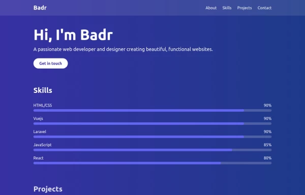
This portfolio page for Claire includes: 1. Responsive design that works on both desktop and mobile 2. Indigo-800 and Blue-900 color scheme for the background 3. Dark mode support (the design is already dark-themed) 4. Beautiful animations and effects: 1. Fade-in and slide-up animations for sections 2. Animated skill bars 3. Hover effects on projects and buttons 4. Smooth scrolling for navigation 5. Mobile-friendly navigation with a toggle menu 6. Sections for About, Skills, Projects, and Contact 7. A contact form with styled inputs 8. Social media links in the footer 9. Accessibility considerations (proper heading structure, color contrast, focus styles) Key features: - The background uses a gradient from Indigo-800 to Blue-900 - The header and footer have a frosted glass effect using backdrop filters - Text is white for high contrast against the dark background - Sections fade in and slide up as they enter the viewport - Skill bars animate when the skills section is in view - Project cards have a hover effect with scaling and increased opacity - The contact form has animated focus states - Social media icons change color on hover - The layout is responsive, with a hamburger menu for mobile screens This implementation provides a visually appealing and functional portfolio page for Claire, using HTML, Tailwind CSS, and vanilla JavaScript for the interactions and animations.
3.7k -
 Navbar
This navbar implementation includes: 1. Responsive design that works on both desktop and mobile 2. Indigo-800 and Blue-900 color scheme for the background and accents 3. Dark mode support with a toggle button 4. Beautiful animations and effects: 1. Fade-in animation for menu items with staggered delays 2. Hover effects on menu items with underline animation 3. Smooth color transitions 4. Mobile menu slide-down animation 5. SVG icons for the dark mode toggle and mobile menu button 6. "Sign Up" call-to-action button 7. Mobile-friendly dropdown menu 8. Accessibility considerations (proper heading structure, color contrast, focus styles) Key features: - The background uses a gradient from Indigo-800 to Blue-900 - The navbar has a white background in light mode and dark gray in dark mode - Text colors are adjusted for readability in both light and dark modes - Menu items have hover effects with color changes and underline animations - The dark mode toggle changes its icon based on the current mode - The mobile menu slides down with a smooth animation when toggled - Desktop menu items fade in with a staggered delay for a smooth entrance - Dark mode is automatically applied based on system preferences - The layout is responsive, with a hamburger menu for mobile screens This implementation provides a visually appealing and functional navbar with various animations and effects, using HTML, Tailwind CSS, and vanilla JavaScript for the interactions.
5.3k