Spinner
Gradient Spinner
This tailwind example is contributed by $@(\/)(\/)¥, on 30-Mar-2024. Component is made with Tailwind v3.4. It is responsive. It supports dark mode. similar terms for this example are loading, loader

Related Examples
-
Animated Title
App Logo or Main Title
7.6k -
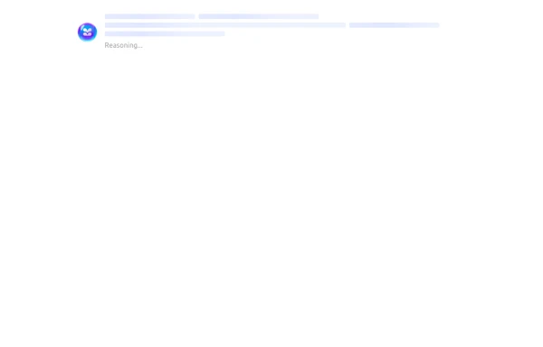 Skeleton Loader
The Skeleton Loader is a placeholder component that creates a smooth loading animation to mimic the layout of the actual content. It enhances user experience by setting clear expectations during data loading. Supports different shapes (rectangles, circles, etc.). Adjustable sizes and durations for animation. Works well with dynamic content such as cards, text, or images. Highly customizable and responsive.
1.1k -
 loader
loader
858 -
Button With Loader
Tailwind Loader
3.7k -

-
 Loading Spinner Component - Animated Circle Loader
Loading spinner component featuring a smooth animated circle loader with dashed border animation. Perfect for website loading states, content loading indicators, and improving user experience during page transitions. Easy to implement and customize for any project.
1.4k -
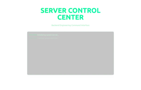 Server Control Center
Server Control Center
-
10.3k
-

-
 6.6k
6.6k -










Browse by topic
Explore components by Tags
Jump straight to the UI pattern you need.
Can't find it?
Didn't find the component you were looking for?
Search across 3,000+ community-built components and grab the code in seconds.