Card section
Card section. find it makecomponents.com
This tailwind example is contributed by makecomponents, on 08-Sep-2024. Component is made with Tailwind v3.4. It is responsive.

Related Examples
-

-
 Interactive 3D Morphing Globe - Sphere to Star
3D interactive particle globe that morphs between a sphere and a star shape. Features custom glassmorphism UI, click-to-pulse bloom effects, and dynamic color themes. Built by Mostafa Niloy (Visernic Limited) using Three.js and Tailwind CSS.
468 -
 3.3k
-

-
 Animated Ripple Avatar
Ripple Effect Avatar (Tailwind CSS Component) A visually striking animated component that displays a centered avatar or image surrounded by expanding ripple circles. Built with Tailwind CSS and custom animations, this effect simulates a pulsing or water ripple reaction, drawing attention to the central image. Ideal for user profile sections, hero banners, landing pages, or highlighted features in modern web interfaces. The ripples gradually fade and expand, creating a soft, calming motion that enhances interactivity and depth.
-
 Experience Card
Experience card section you can use for portfolio or other profiles.
4.4k -
 ApexCodeStudios.com Social Media Post Card
Get Access to 216+ Free Premium Tailwind CSS UI Components at apexcodestudios.com. This component excels with its clean typography using Inter font, smooth hover effects, responsive design, and seamless light/dark mode switching.
-
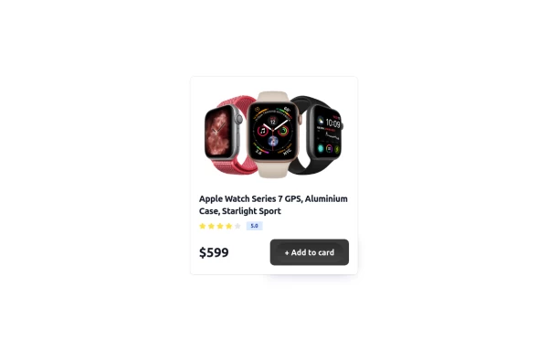 Card
Simple Card
2.4k -
 Pricing section Lima
 with responsive design
-
 13.4k
-
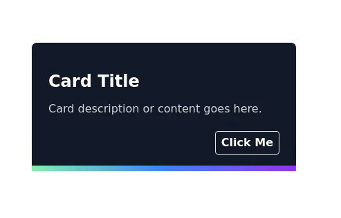
-
 Animated Profile Card
Animated profile card with profile completion circle
2.3k





Browse by topic
Explore components by Tags
Jump straight to the UI pattern you need.
Can't find it?
Didn't find the component you were looking for?
Search across 3,000+ community-built components and grab the code in seconds.