Pulsing Button Effects
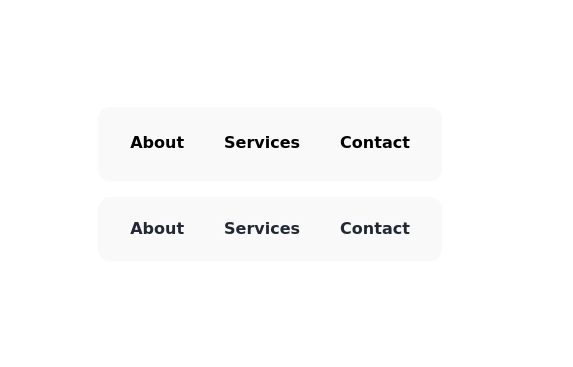
A pulse animation applies an opacity ramp to the layers in a symbol. You can choose to animate only layers marked as “always-pulses” or all layers simultaneously. Participating layers reduce their opacity to a minimum value before returning to fully opaque.
This tailwind example is contributed by Augustin, on 22-May-2025. Component is made with Tailwind v3.4. It is responsive.

Related Examples
-
-
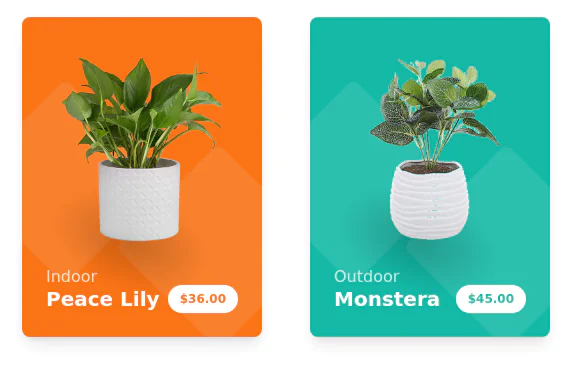 Products cards w/ hover effect
Example of product card grid with product image, pricing and a hover effect FORKED FROM: https://tailwindflex.com/noob_dev/products-card-grid
20.2k -
 home tools
seller goog
1.8k -

-
 news coffee &tea
According to large population studies, coffee and tea both appear to be good for your heart, lowering risk for heart disease and stroke.
940 -
 Rwanda Investigation Bureau
1.1k -
 Sharp corner button design
button with hover effect
13.5k -
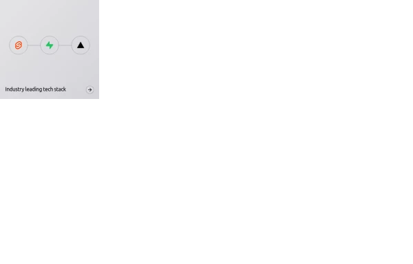 Animated bento box.
A Coastal UI component (coastalui.com). This can be used as part of a bento box, great for showing connectivity between context, could be used beyond just showing tech stacks.
2.2k -
 Corner‑Framed Hover Transition Buttons
Minimal CTA buttons featuring animated corner shapes and smooth width transitions on hover, built with Tailwind CSS for a sharp, modern UI.
22 -
 game
playing game
1.5k -
 school secondary
school
1.6k -
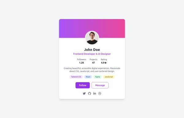 Uses emoji for attention, mentions key features (modern, responsive, accessible)
Drop-in Tailwind CSS profile card component with responsive layout, gradient header, and hover effects - zero custom CSS needed. Features skill tags, social icons, and clean stats display. Just copy-paste the HTML, swap in your details, and you're live. Perfect for portfolios, developer profiles, or link-in-bio pages.




Browse by topic
Explore components by Tags
Jump straight to the UI pattern you need.
Can't find it?
Didn't find the component you were looking for?
Search across 3,000+ community-built components and grab the code in seconds.