40+ Free Newsletter examples in Tailwind CSS
A newsletter section is important because it allows businesses to communicate with their customers and subscribers, build relationships, increase brand awareness, and drive website traffic. It also provides a way to collect customer information for targeted marketing campaigns.
Here is a collection of newsletter forms, newsletter call-to-action, and newsletter sections.
Similar terms: Email campaign
-
 Subscription
Subscription list
1 year ago1k -
-
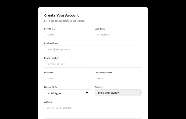 Responsive Form
This modern, fully responsive account creation form is designed using HTML and Tailwind CSS, ensuring a clean, professional, and accessible user experience. It features a card-based layout with smooth spacing, a subtle shadow effect, and a structured grid system for optimal responsiveness across all devices.
1 year ago1.4k -
 Modern Dark Footer with Overlapping Gradient CTA
A comprehensive, dark-themed website footer component built with HTML and Tailwind CSS. It features a visually distinct overlapping section with a colorful gradient background containing a prominent call-to-action (CTA) block. The main footer area utilizes a multi-column grid layout for organized navigation links, a newsletter signup form, and social media icons. A final bottom bar includes legal links and copyright information. The design is responsive and adapts its layout for different screen sizes.
10 months ago1.1k -
 cards
cardshtml , css ,
10 months ago959 -
 9 months ago560
 -
 Newsletter
This template ensures your newsletter stands out with smooth animations, professional design, and a responsive layout.
9 months ago742 -
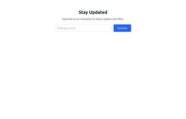 newsletter
Subscribe to our newsletter for latest updates and offers.
9 months ago910 -
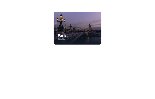
 Newsletter section - Htmlwind
Centered with images
9 months ago893 -
 8 months ago865
 -
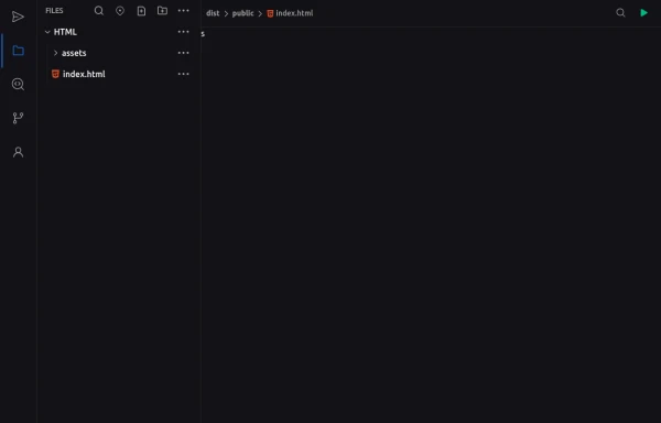 Code Editor UI
Simple code editor prototype made with HTML and TailwindCSS. A lightweight template to explore and customize.
6 months ago473 -
 4 months ago374
 -
 Newsletter Section
On your website or application, add a beautiful and responsive Newsletter Subscription Form. These Tailwind CSS Newsletter Forms are easy to use and customizable, allowing you to create a wide range of newsletter form styles that suit your website's design.
1 month ago21 -
 Modern Editorial News & Events Section
Overview: A sophisticated, responsive layout designed to highlight a primary featured story alongside a vertical list of recent updates or upcoming activities. It features a clean "magazine-style" aesthetic, utilizing serif typography for headings to create an elegant, high-end feel suitable for professional services or educational institutions. Key Features: Split Grid Layout: Uses a 12-column grid system (lg:col-span-7 vs lg:col-span-5) to balance the large featured content with the side list. Featured Card (Left): Image Zoom: subtle scale-105 transformation on the main image when hovering over the container. Backdrop Badge: A frosted glass effect category badge over the image. Interactive List (Right): Smart Date Boxes: The date indicators act as design elements that invert colors (e.g., yellow background to yellow text) on hover. Micro-interactions: List items "lift" slightly (-translate-y-1) upon interaction. Typography: Integrates Google Fonts (DM Serif Display) for headings to break the monotony of standard sans-serif fonts and add character. Tech Stack: Framework: Tailwind CSS. Icons: Ionicons (Script included). Fonts: Google Fonts (DM Serif Display + Inter). Usage: Ideal for "Latest News," "Upcoming Seminars," or "Blog Highlights" sections on a landing page. Ensure the Google Fonts link is included in the <head> for the correct visual style.
3 months ago279 - Contribute yours


Didn't find component you were looking for?
Search from 3000+ components