87+ Free Input examples in Tailwind CSS
-
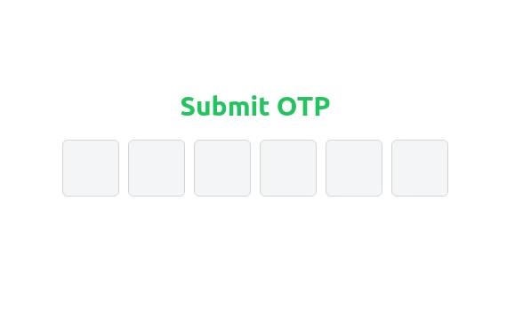 Elegant OTP Input Fields with TailwindCSS
A clean and responsive OTP input field component built with TailwindCSS. This design features six single-character input fields with smooth transitions, light gray borders, and backgrounds. On focus, the borders turn blue, creating a visually appealing and user-friendly experience. Perfect for authentication and verification forms.
1 year ago1.8k -
-
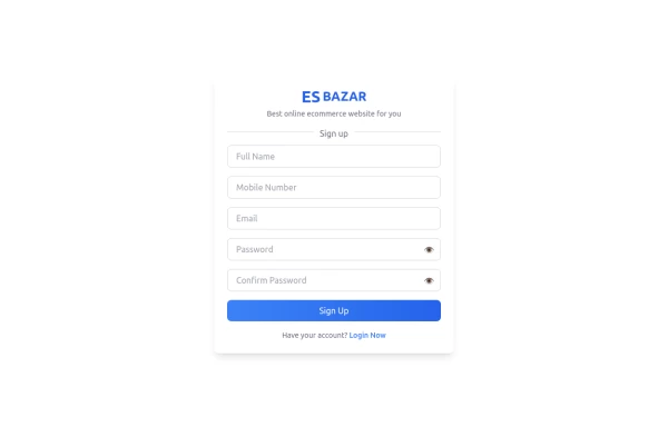 Responsive Sign-Up Form with TailwindCSS
Create a visually appealing and fully responsive sign-up form using TailwindCSS. This form includes input fields for full name, mobile number, email, password, and confirm password, along with a gradient sign-up button. Designed with simplicity and flexibility, it is perfect for modern web applications and easy to integrate into any project.
1 year ago1.5k -
 Multi Range Slider
Adjust the sliders to set your preferred price range. The left slider sets the minimum price, and the right slider sets the maximum price. The selected range is displayed below the sliders in real-time, allowing you to easily filter products within your budget.
1 year ago1.9k -
 1 year ago1.7k
 -
 1 year ago1.1k
 -
 Responsive Footer Section
This modern and responsive footer adapts seamlessly to all screen sizes, ensuring a clean and organized layout. It includes essential navigation links, contact details, and a subscription form, all structured for easy access. Using display: contents;, the design remains flexible and visually balanced, enhancing the user experience across devices.
11 months ago684 -
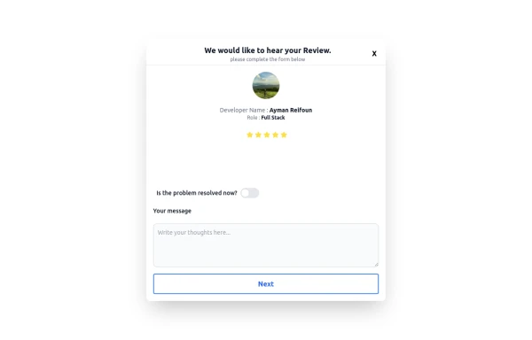 Review popup form with toggle and stars
Review popup form with toggle and stars
10 months ago901 -
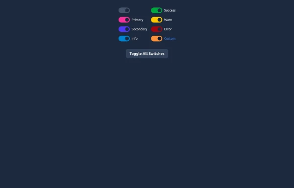 Elegant Switches
Useful Tailwind classes for creating several types of basic switches.
10 months ago795 -
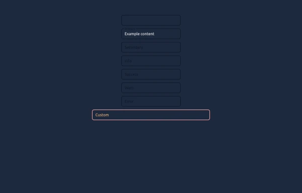 Elegant Textboxes
Useful Tailwind classes for creating several types of animated textboxes. Inspired by Google's floating label input fields.
10 months ago687 -
 10 months ago631
 -
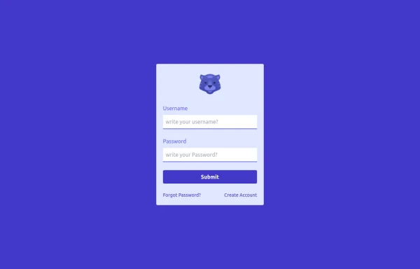 login
loginhtml , css
10 months ago647 -
![Material 3 Checkboxes [Light]](https://tailwindflex.com/storage/thumbnails/material-3-checkboxes-light/canvas.min.webp?v=10) Material 3 Checkboxes [Light]
Material 3 Checkboxes [Light]Checkboxes that conform to Google's Material 3 design guidelines
9 months ago495 -
![Material 3 Radio Buttons [Light]](https://tailwindflex.com/storage/thumbnails/material-3-radio-buttons-light/canvas.min.webp?v=9) Material 3 Radio Buttons [Light]
Material 3 Radio Buttons [Light]Radio buttons that conform to Google's Material 3 design guidelines
9 months ago732 -
![Material 3 Text Fields [Light]](https://tailwindflex.com/storage/thumbnails/material-3-text-fields-light/canvas.min.webp?v=3) Material 3 Text Fields [Light]
Material 3 Text Fields [Light]Text fields that conform to Google's Material 3 design guidelines. Can be used for single-line text fields as well as textareas.
9 months ago998


Didn't find component you were looking for?
Search from 3000+ components